Deliveree
UX, IxD
Case Study
A mobile + tablet B2B product that improves delivery efficiency and order tracking for the restaurant business.
Project Overview
Deliveree (formerly Urban Delivery) is a B2B driver service that provides on-demand delivery personel to restaurants (kind of like Uber, but for food). Food delivery is a time-sensitive business: food quality starts declining the minute that it gets off the line and it can be terrifying to hand a product (the face of your business) over to an unknown third party. For this three week project, my team was tasked with the challenge of improving the existing product for restaurants and building out an internal, driver-side application for Deliveree's driver fleet.
The Analysis
Through our research we found that there is a a consistent issue of accountability. When restaurants hand their product off to a third party, the current method did not allow for restaurants (or customers) to know the whereabouts of the delivery driver (and the food order). Restaurants were in the dark regarding the status of their deliveries. There is also a secondary issue of time efficiency. Food starts degrading in quality the minute that it gets off the line and delivery drivers are often faced with unforeseen roadblocks that slow delivery time or have to manage multiple orders at one time. Drivers needed a streamlined way to optomize their deliveries routes so that they could quickly and efficiently delivery mulitple orders.
The Conclusion
Our solution to this issue of accountability and time efficiency was a product that allowed restaurants to monitor their deliveries through tracking and status updates and drivers to optomize their delivery routes through order management and navigational check-points. To account for the issue of accountability, we structured our driver features so that they consistently reported delivery check-points (such as "picked-up" and "dropped-off" order) to restaurants, while simultaneously serving as an efficient delivery map for drivers. The result was a streamlined, efficient delivery tracking platform that assisted both parties in delivering a quality product in the quickest way possible.
Here's our full process...
Initial Research
Understanding the Product
Our first stop to a final product was a solid understand of Deliveree's current state. That meant a closer examination our client's (restaurant only) facing product, the developer's "2.0" transitional version, and an evaluation of users' current means of navigating through the delivery process.
The live product that restaurants were using involved a very basic, three-screen flow. A quick examination of the product and we had two conclusions: there was no confirmation that a driver was contacted and there was no alert or confirmation when the delivery was completed. Restaurant users were stop-pulled through a flow, left to do their own detective work to find any indication that an order had a driver had been requested or an order had been delivered. While we noted this lack of confirmation as a potential issue, we wondered if users felt the same.
Deliveree's live, restaurant-facing product was very simple and only allowed users to request a driver.
Since there was no existing driver-facing product, the existing method of delivery order assignment/pick-up was much more hands-on. The current method of driver dispatch boiled down to one man and a mobile tablet. This single dispatcher would receive a delivery request, and manually dispatch a driver. Drivers would then confirm that they had accepted the delivery order through text message, and the delivery process would start. Here we saw an opportunity to define the driver product from the ground up, while centering around replacing the cumbersome manual flow with a seamless automatic one.
In order to keep our product in line with business considerations, we briefly outlined Deliveree's business needs. Our initial client meeting had made us aware of two features that we knew we would have to somehow fold into our final designs:
- Crowd-sourcing - as it expanded business, Deliveree wanted to move from scheduling driver shifts to be fully crowdsourced. For us this meant paying attention to ways that we could best account for different levels of users.
- Customer database - a common painpoint from our intial talks with users was the manual process of inputting individual customer data. To counteract this, Deliveree was already building a customer database that would pull-up past customer data for easy input. For our design, this meant paying attention to how we could successfully integrate this feature and further optimizing it's installment.
With a fuller understanding of the current situation in which driver and restaurants were completing the delivery process, we formed an initial problem: Restaurants need a streamlined way to request drivers and monitor deliveries, while drivers need a way to effectively manage their immediate and upcoming/scheduled deliveries.
Understanding The Market
After noticing the issue of tracking and efficiency from our preview of the current situation, we turned toward domain research to see if we could uncover more. After reading many articles surrounding the food delivery business, our biggest takeaways were that:
1. Restaurants = Hesitant to Outsource
While delivery services are highly useful to restaurants in many ways (no extra staff to account for, less logistics, etc) Food delivery can be stressful for restaurants because they are handing their product over to a third party. In a business where product = reputation, who is handling your product (and how) can make or break you.
2. Drivers = feel the pressure
Drivers feel an immense amount of pressure (both from restaurants and employers) to make speedy deliveries but they are often subjected to uncontrollable factors that slow them down. They benefit from fast deliveries (frees them to complete more deliveries in one shift) so a streamlined delivery process = less headaches + more tips.
After domain research, we turned towards evaluating relative competitors. Our goal was to see where Deliveree, and our final product, would fit in the current marketplace.
At the result of competitive analysis one thing was clear: the food delivery business is highly saturated. But Deliveree did occupy a niche. By being high touch, low cost, Deliveree fit into this crowded market. A focus on customer service and a fleet of trained drivers, rather than crowdsourced drivers (like many existing competitors such as Postmates or DoorDash) and an emphasis personalization allowed the business to stand apart from competitors.
At the conclusion of our intial research, we had some lingering questions: how were we going to design for a “high-touch” feel to our restaurant users when the dispatcher transitioned to automated? There was also the question of drivers: since the company would be moving towards crowd-sourced drivers as they scaled to be larger, how would our product be able to maintain quality control? We knew that these touchpoints would have to be factored into our final design.

User Research
After a solid grounding in the product’s existing state and research, we transitioned our focus to our users. For a successful user experience we needed to fully understand both perspectives. Our goal was to create product that found a happy medium that encompassed the best user experience for both.
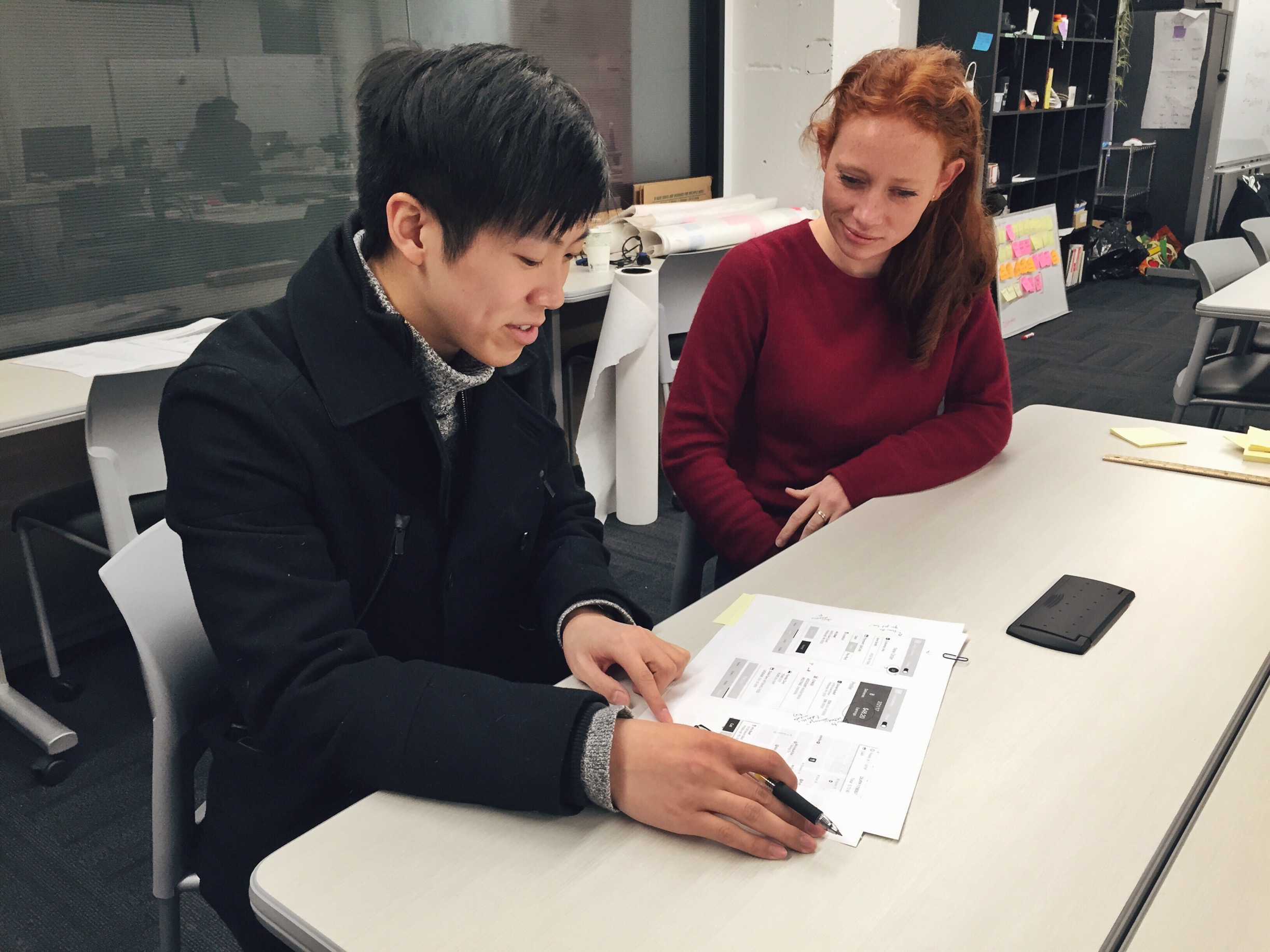
We completed several rounds of user interviews with both drivers and restaurant staff understand the current delivery experience.
A crucial aspect to laying the groundwork was the usability evaluation of the 2.0 version. This beta “2.0 version” was existing, transitional wireframes that were in the works to replace the live version, but had yet to be turned into a digital product. We used this as an opportunity to situate users in the context of a real situation, and put these wireframes in front of users during interviews to hear their thoughts.
Our Drivers
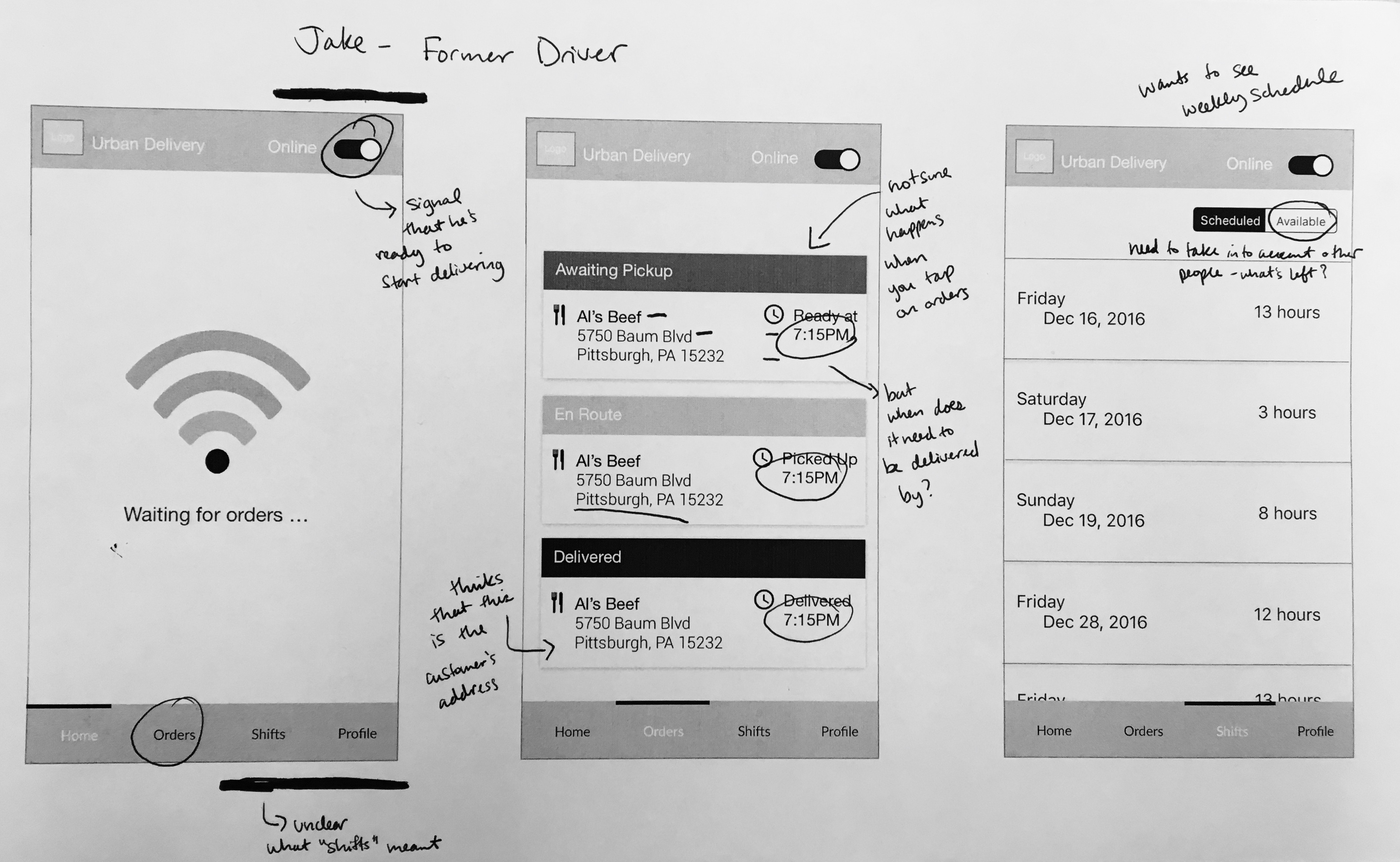
The 2.0 version with notes from a driver user. The evaluation of the 2.0 version gave us insight about existing user mental models.
For our driver users, our largest questions were aimed at trying to get a full picture of what the current delivery process looked like. Since we were building a driver-facing product from scratch, we wanted to get an aerial view of their entire experience so we could strategically hone in on features or flows that would best serve their needs. After speaking with users, we learned that our drivers wanted:
1. A line of sight
Drivers wanted to know what came next, whether it was the next step they needed to delivery process or a visual representation of
"I need to know what orders are awaiting pickup so I know where I am going next." - Tso, Driver
2. Progression of orders and deliveries
Drivers need to see lot's of information, but they prefered to have it broken down for easy glanceability.
"I only want to know where I need to go. I don't need the rest of this." - Max, Driver
3. Ability to keep records
Drivers also wanted the option to record what they had earned and track where they had gone.
"I made statistics to track my earnings. This is really important to me. We get paid in cash so I need to note how much I am making. " - Billy, Driver
Our Restaurants
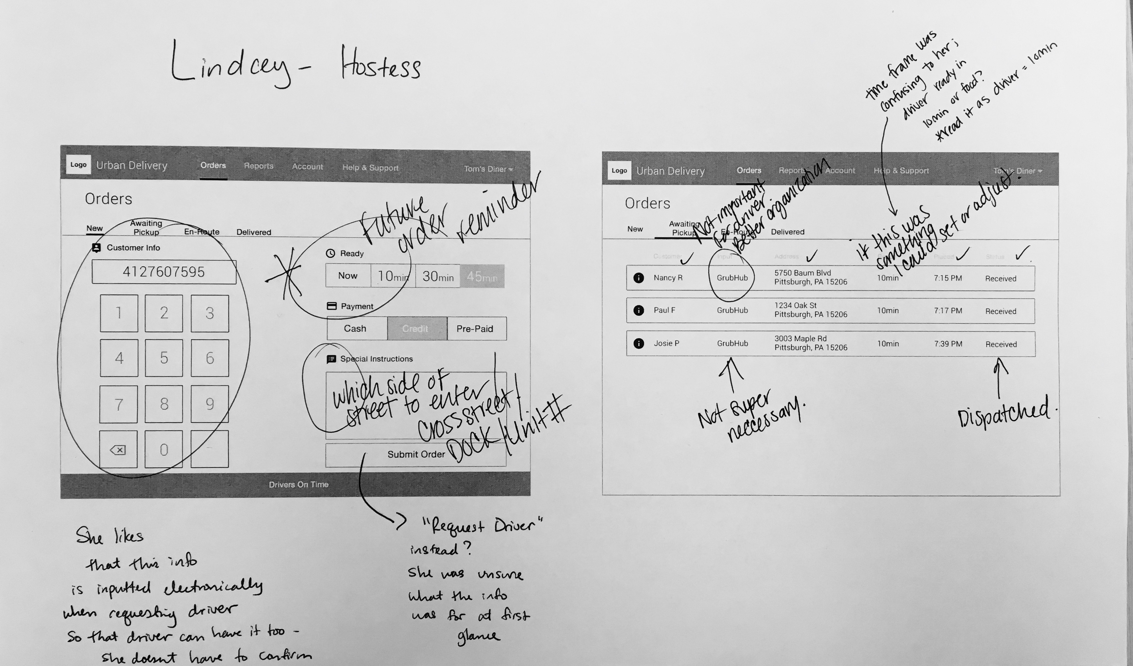
The restaurant 2.0 wireframe with notes from one of our restaurant users.
For our restaurants, the biggest thing that we wanted to know the user's’ general experience with the current delivery process. Since we were dealing with an existing product, we were more interested in the more intricate details of the existing flow, but also wanted to diagnose any larger scale needs that were not currently being met. We learned that the most important features to restaurants were:
1. Tracking
Restaurants wanted to know that their product was being handled in a professional way; since they were releasing their product to a third party, tracking orders held this third party accountable.
"I would prefer to know where the driver is on a map in real time. You can hold the driver accountable in case something happens with the order." - Olven, Server
2. Time Efficiency
Food starts declining in quality the minute it comes of the line; every second counts to get the food to the waiting customer and ensure that their meal is the best quality.
"Food delivery is a time sensitive business. Even saving two minutes, or thirty seconds, will make a big difference." - Paul, Restaurant Manager
3. Flexibility + customization
Every customer order is different, things need to be flexible enough that restaurants can easily and quickly adjust order information. And every restaurant is unique; individual restaurants place emphasis on different information.
"I need to be able to edit these orders. What if the customer calls and they don’t want their food anymore?" - Lindcey, Hostess
4. Progressive disclosure of details
Similar to drivers,restaurants also wanted to know specific details; but there was a fine line between giving them access to all the information that they needed without being overwhelming.
"I just want to know how long it took to get to the customer, not the actual time, but I still want to be able to access this [duration]" - Paul, Restaurant Manager
Narrowing in
Defining our users
With two sets of users and two sets of demands to build for, we needed quick reference points to stay aligned with our two users' specific needs. In order to define these needs for our team and our clients, we created two personas:
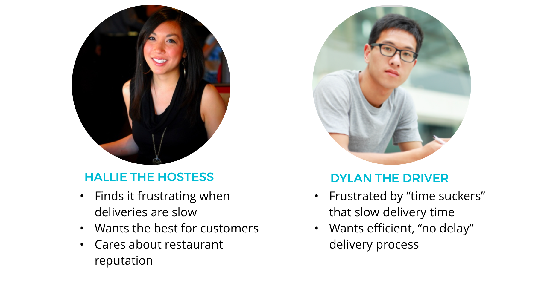
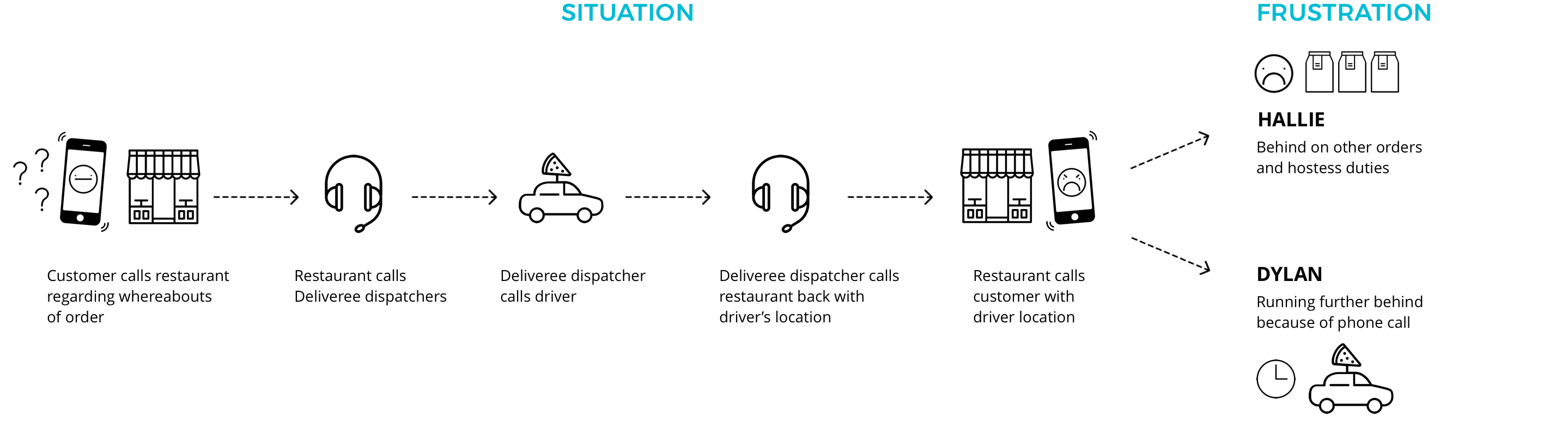
Through building our personas, we pieced together a re-occurant, pain-point scenario that emerged from our user interviews. It involved the process and frustrations of tracking orders for both restaurants and drivers. There was a consistent frustration among our restaurant staff regarding trying to locate orders.
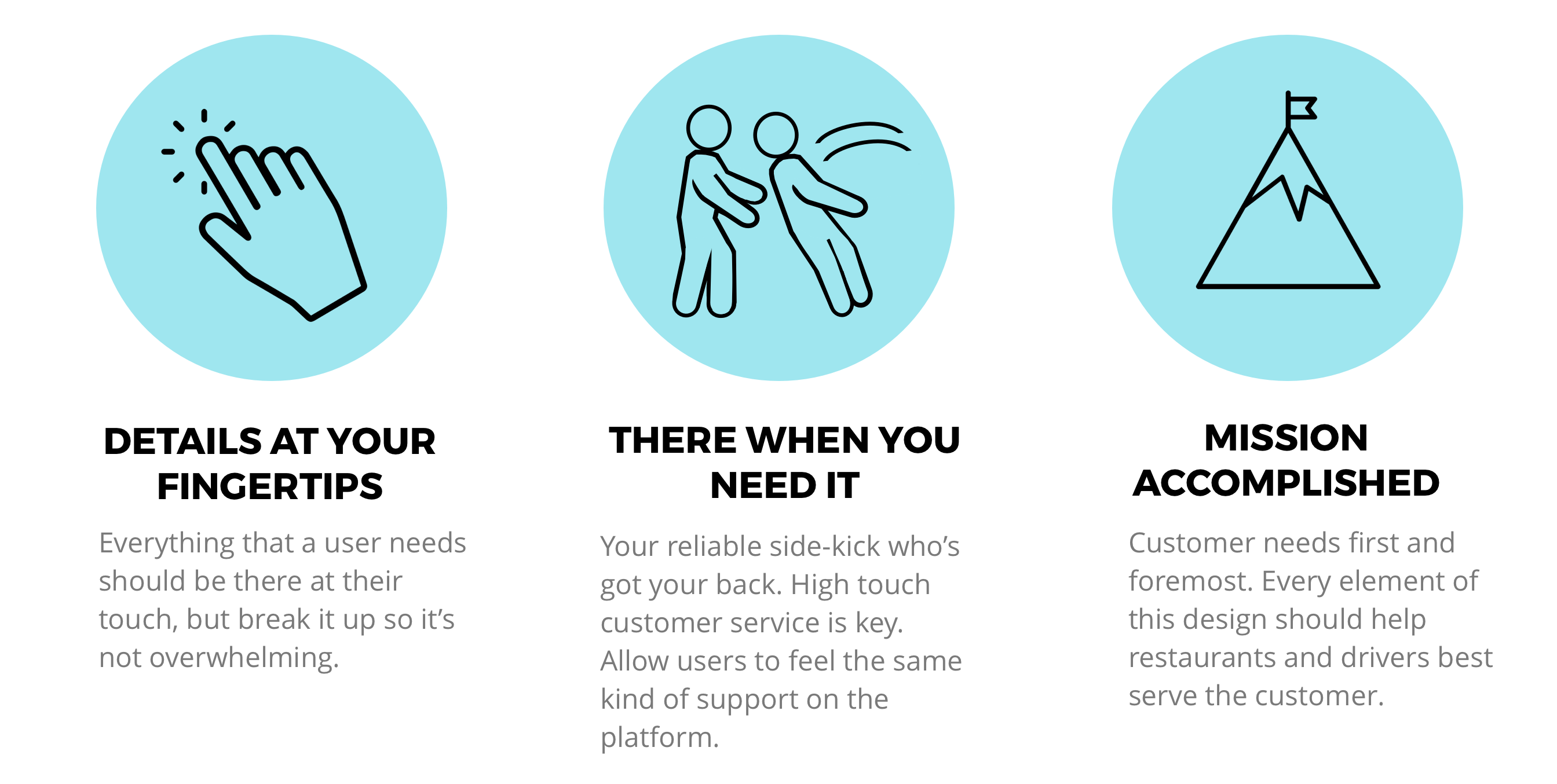
To further chart the course for both our products, we created a series of design principles. These priniciples would ensure that we maintained a consistent balance of user needs:
Defining our Product
We completed several rounds of user interviews with both drivers and restaurant staff understand the current delivery experience.
After user interviews, we had a lot to shift through. With two sets of users, we found ourselves trying to balance various user needs against each other to meet a common end goal: speedy deliveries. Deliveree had told us to place emphasis on restaurants, since restaurants were their direct clients, but we noticed trends that suggested that drivers and restaurants couldn't be wholely divorced. We saw that time is everything in the restaurant business. Food begins declining the second that it comes off the line; it gets colder, soggier, and loses quality the longer it is not eaten. For restaurants, what this really translated to was reputation. Restaurants maintain their business through the upkeep of their product and their reputation depends on the quality of the food that they their serve their customers. Drivers also cared about optimization. Wasted minutes on the road made the delivery process collectively more stressful. Every minute counts, so it’s best for all involved if food gets to its destination in a speedy manner.
We also knew that restaurants cared about accountability. As restaurants were handing their product off to a third party, they saw it as essential to have some sort of control over the product; they currently maintained this through driver familiarity. With further digging, we realized that it was not necessarily the familiarity that was important, but the underlying aspect of accountability. Familiar drivers were more easy to be held accountable, but with Deliveree expanding to include unfamiliar, crowdsourced drivers restaurants would be losing this familiar (and reasurring) touch.
With these two tenents defined, we found ourselves in a hierarchy of user needs. We needed an efficient, delivery-tracking application to serve restaurant needs but it's features would hinge on input from the driver application. We also needed to consider drivers' needs, in that they needed a streamlined way to manage multiple deliveries and best optimize delivery routes. It was going to be balancing act of playing the users, and our dual products, off of each other in order to create a successful user experience for both.
Considering these new insights, we revisted our initial problem statement to define the full opportunity that our product would be solving for:
While restaurants need a streamlined way to request drivers and monitor deliveries and drivers need a way to effectively manage and optimize deliveries, both users need a way to get on the same page surrounding the delivery process.
Exploring Solutions
For our initial designs, our concepts were built around features that we assumed would be the heaviest touch-points during the delivery ordering process for both drivers and restaurant owners. Prototyping meant thinking in flows and interactions between the two different devices, instead of just screens.
Drivers
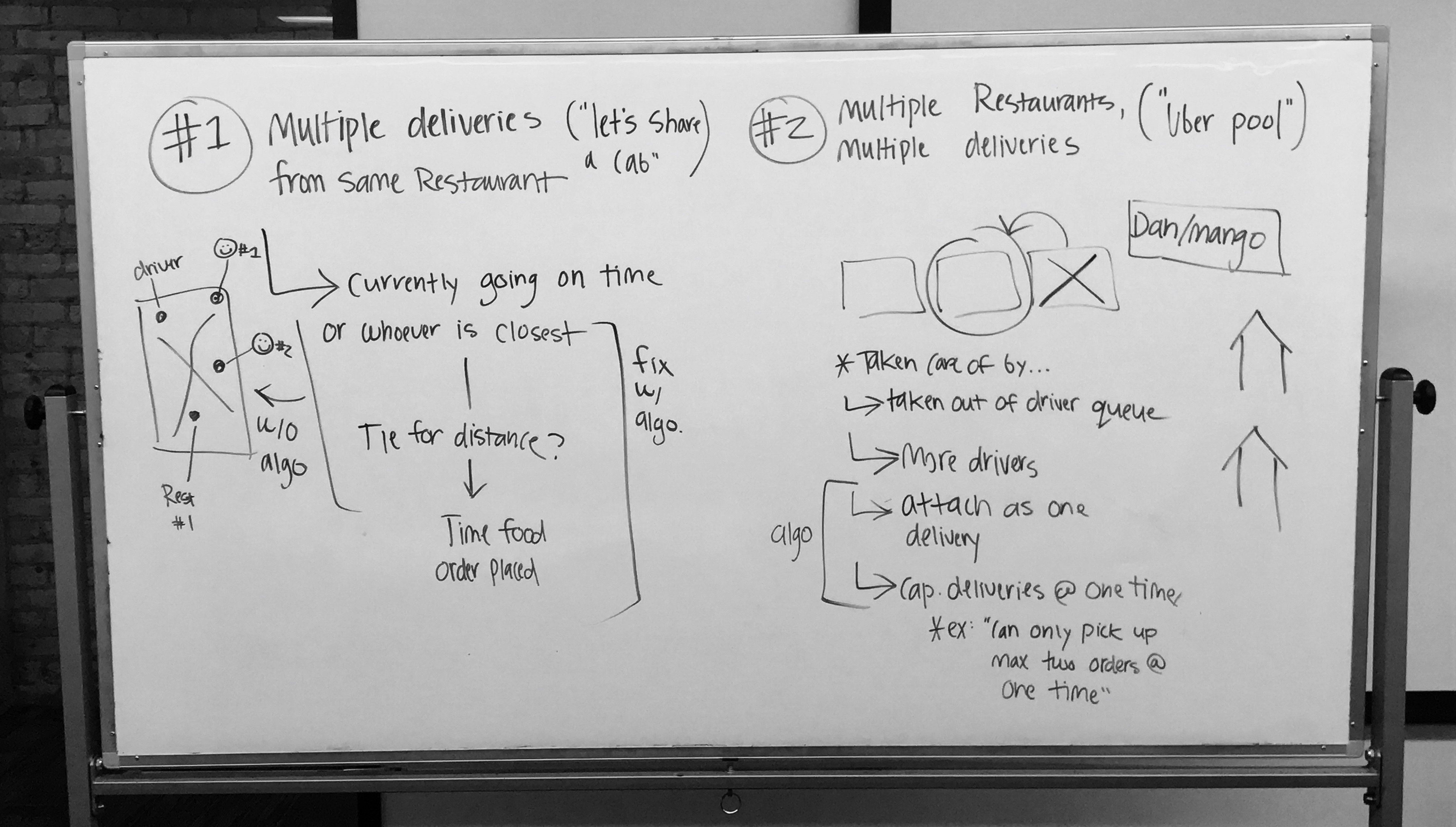
For our driver users, we defined both flows and features. We wanted to know what information was necessary (and at what parts of the delivery process) and how to best display multiple deliveries. We started by addressing the issue of multiple deliveries. From our interviews I noticed that our driver users often had many deliveries at one time, so I defined how the two situations would look. Drivers were placed in one of two scenarios: 1. deliver several different orders from one restaurant, which reauired one pick-up with multiple stops; 2. deliver different orders from different restaurants, which meant drop-offs interchanged with pick-ups. To test both delivery scenarios, we built out two flows and tested with users.
I drew out the two situations in which deliveries could occur so that we could translate them to flows and test with users.
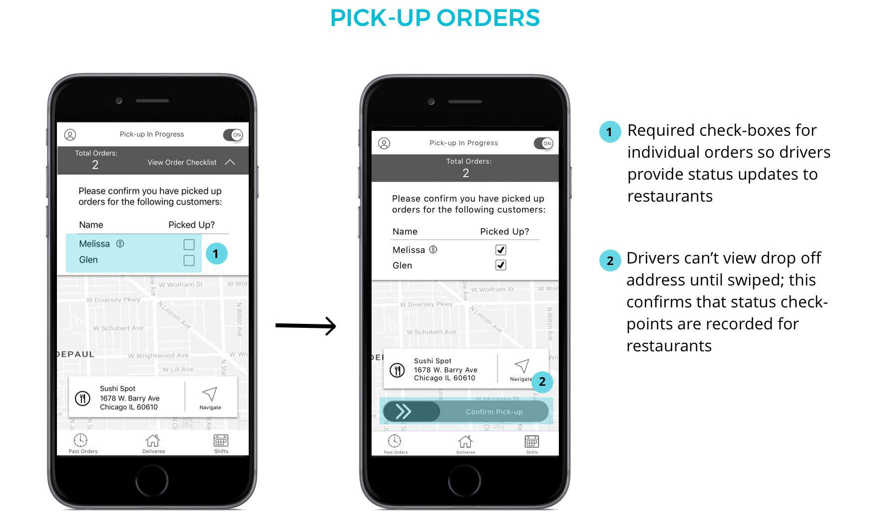
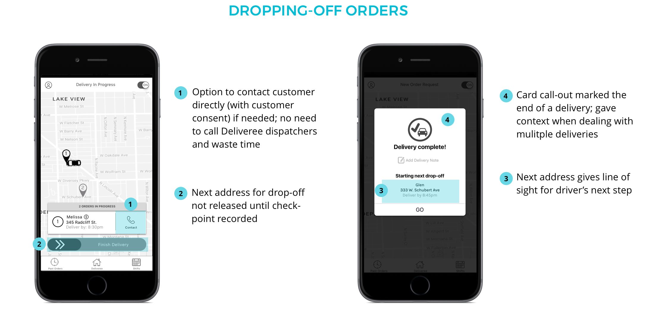
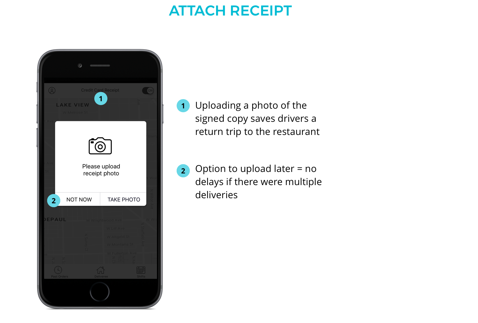
We also needed to account for our restaurant's needs in relation to the driver product. To provide the accountability for restaurants, we built “checkpoints” in the form of CTAs that drivers had to "check-off" before they were allowed to continue on with their delivery. Drivers would be required to stop and "swipe" to indicate completion after picking up and dropping off each individual order so that restaurant could monitor delivery status. In order to ensure that drivers recorded these check-points, we strategically built so that the next piece of information in their delivery would be hidden until the check-point was recorded. This feature was the most necessary step in ensuring that restaurants received the necessary information to track-orders from their end.
We then honed in on individual features. We wanted to define the best visual layout and pertinent content for two key "crux" screens:
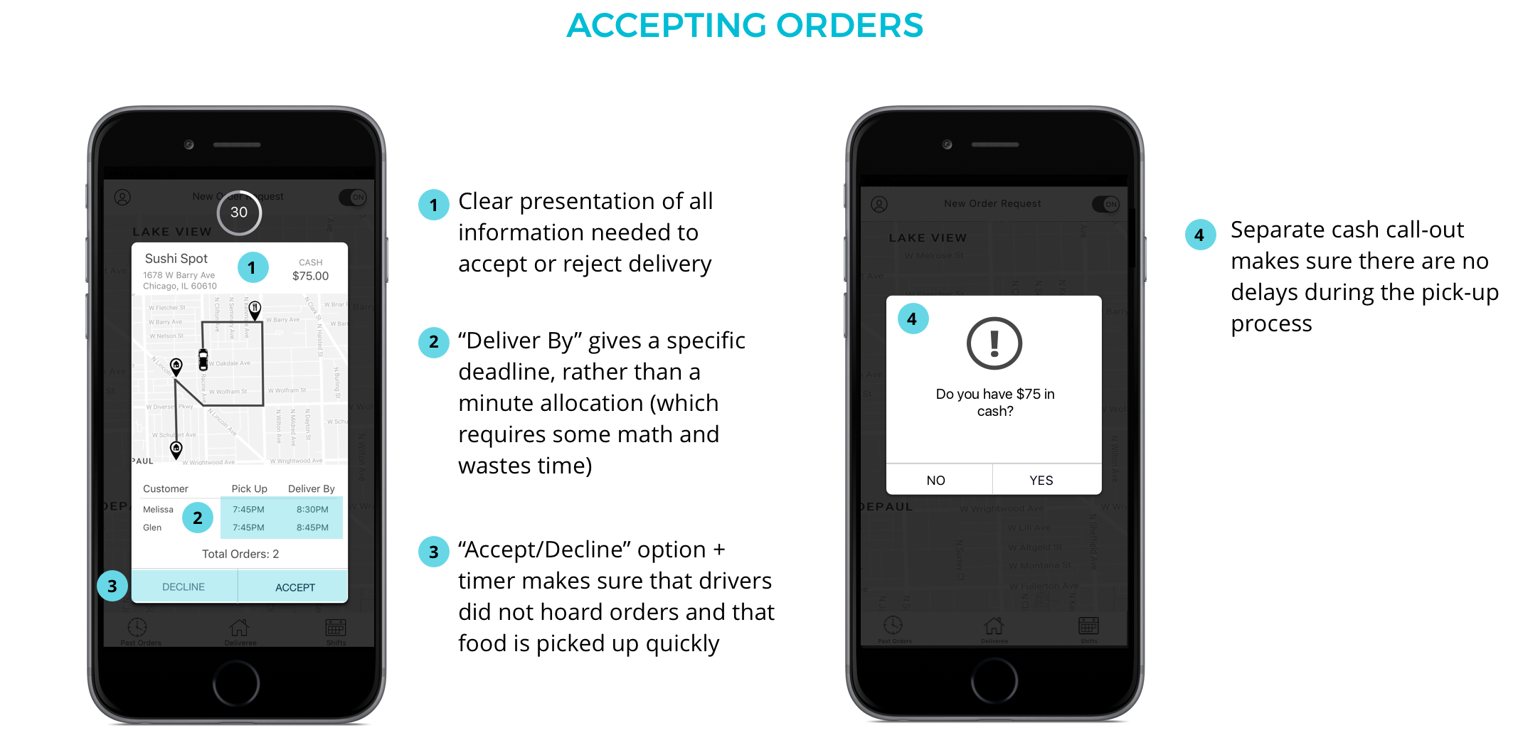
1. New order requests - what a driver would see at the beginning of a delivery, with the option to "accept" or "decline" the job.
2. The delivery "line-up" - the full number of stops (including order pick-up and drop-off) that a driver would be making to complete a delivery.
New Order Request:
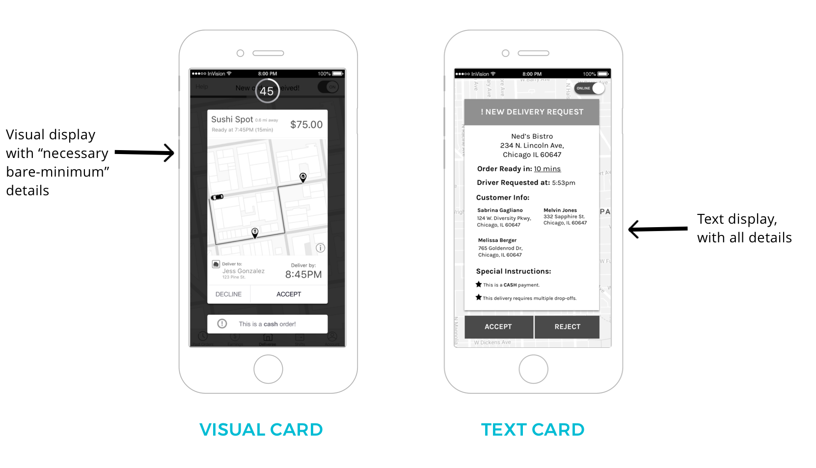
Here drivers prefered a visual card. A more spaced out, visual representation was eaiser to scan than a heavily stacked text view. Since drivers would be referencing this information quickly, drivers needed information to be scannable, with pertinent content spaced out rather than stacked in heavy text.
Viewing Delivery "Line-up":
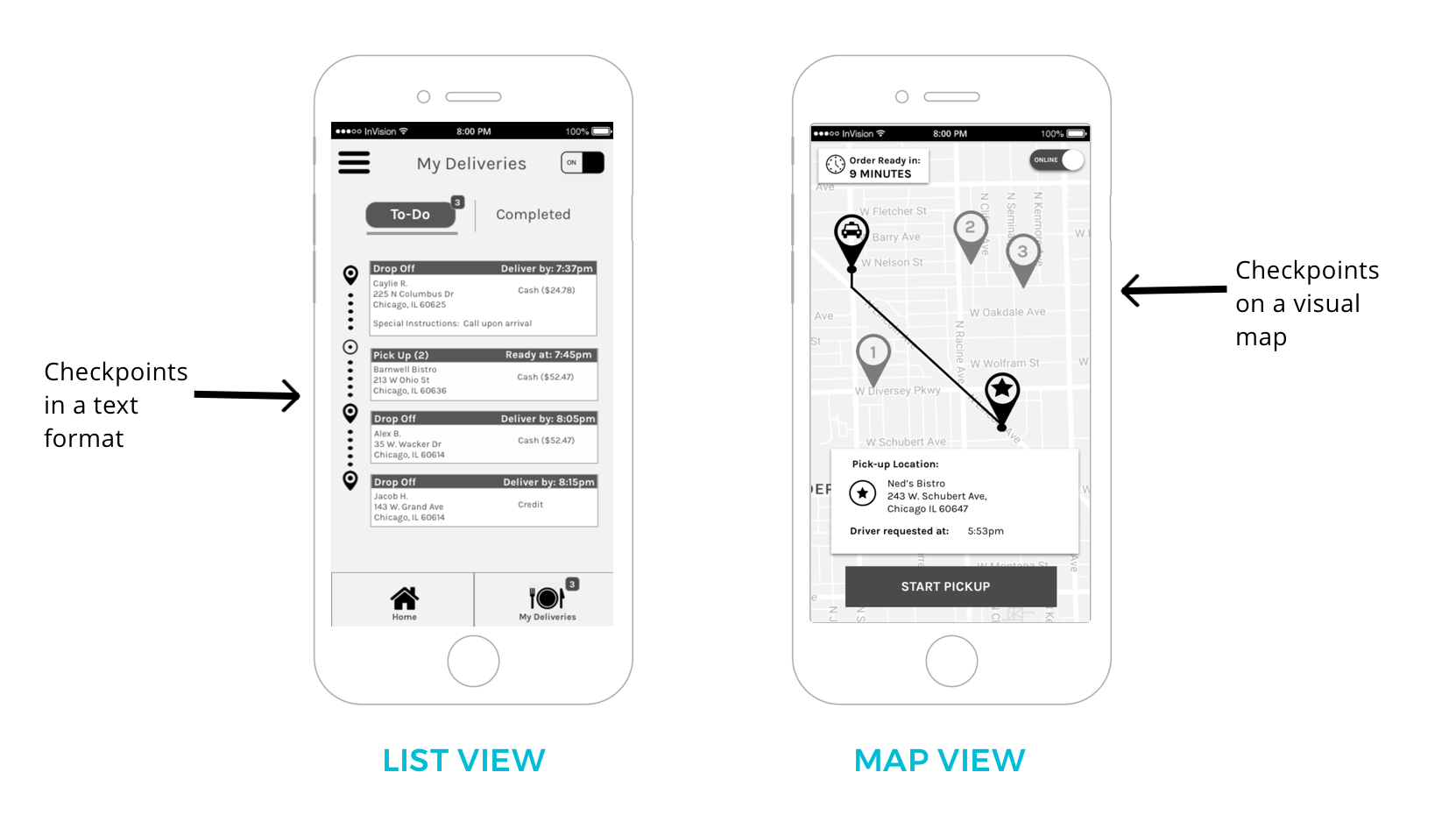
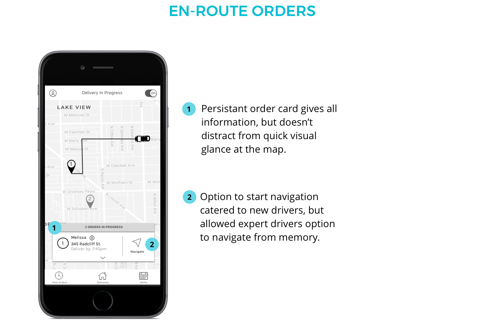
In terms of viewing a delivery line-up, drivers again preferred the more visual version (the map view). We learned that most drivers thought about deliveries in terms of a map, so the map view jived well with their existing mental model. With multiple orders to be managing, a map also allowed drivers to mentally plan their route and gave them a line of sight for their entire delivery.
Restaurants
For restaurants, we needed to refine content. Generally we wanted to test the process of requesting a driver and the process of monitoring orders. Specifically we wanted to define what information was most important (and where) and what information was necessary for tracking orders.
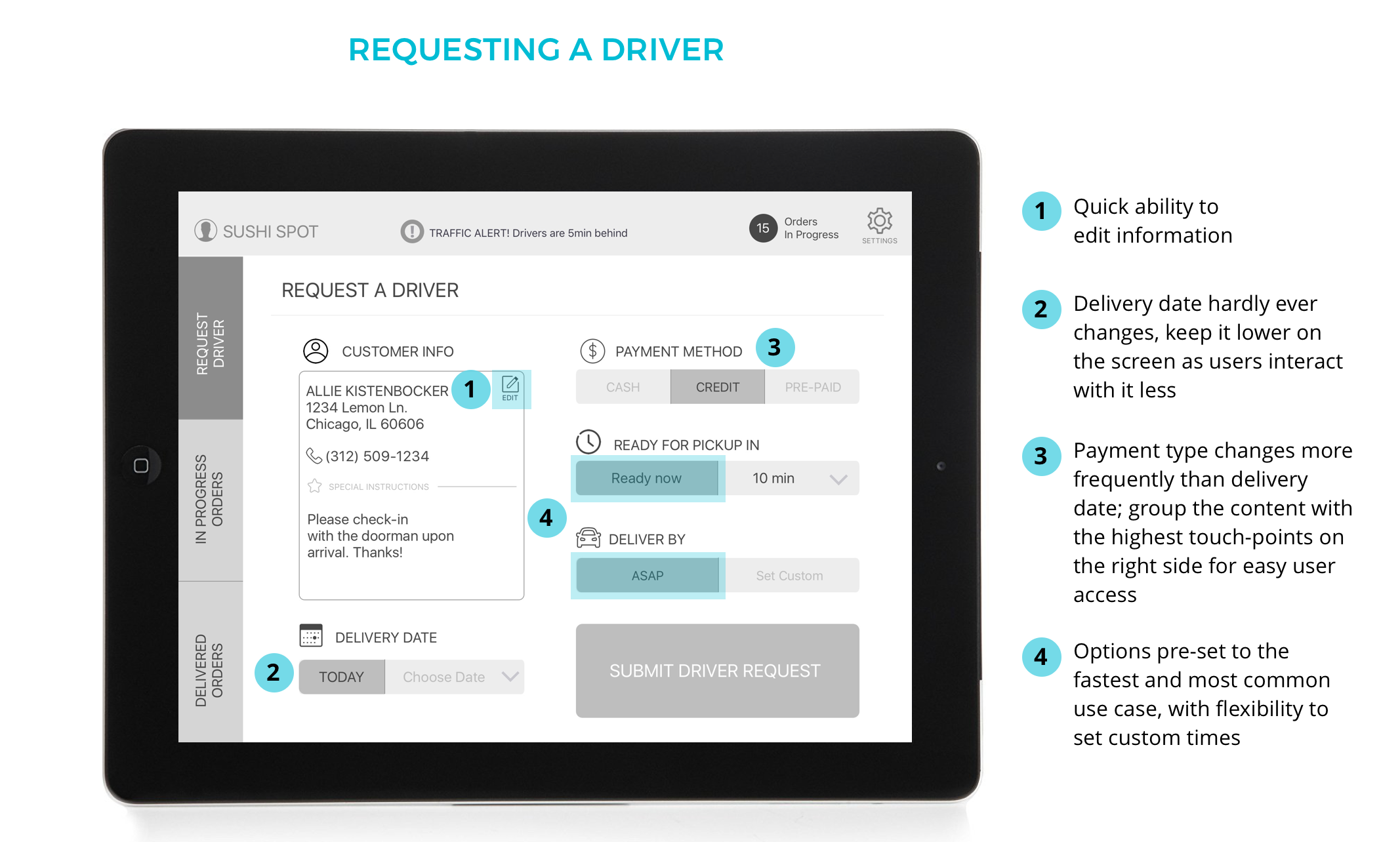
Requesting a driver
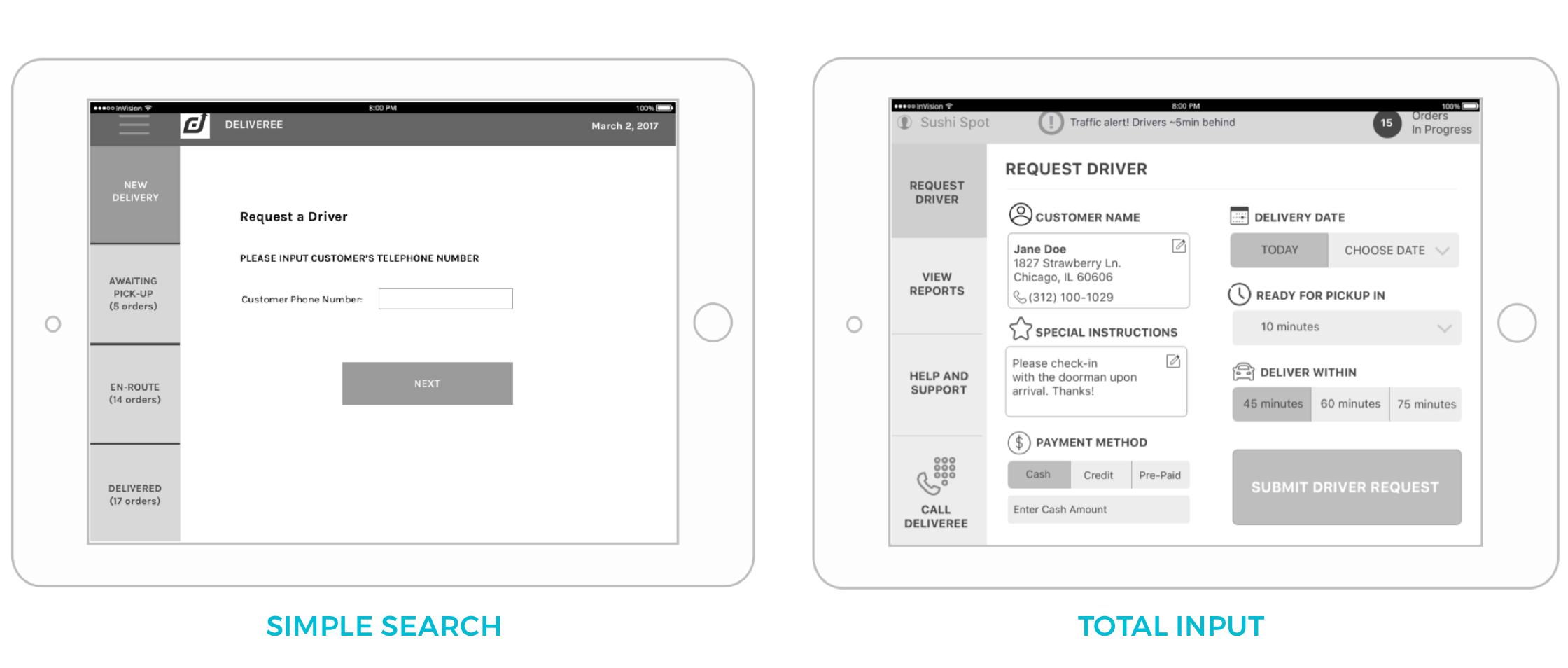
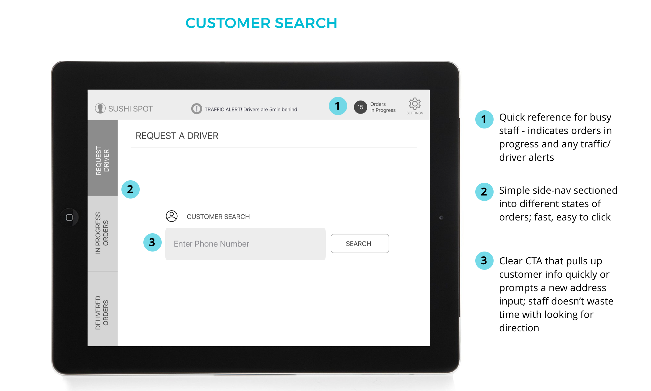
The driver request process would start with the process of entering customer information; users would either "search for" or "add a customer". For our concepts users were presented with a direct CTA to search by phone number, or the option to input customer information in directly. Users preferred the direct CTA "simple search" because it gave them a clear task. Busy hostesses and wait-staff wanted one, clear input feild where that they could quickly tap and access customer information.
Monitoring a delivery
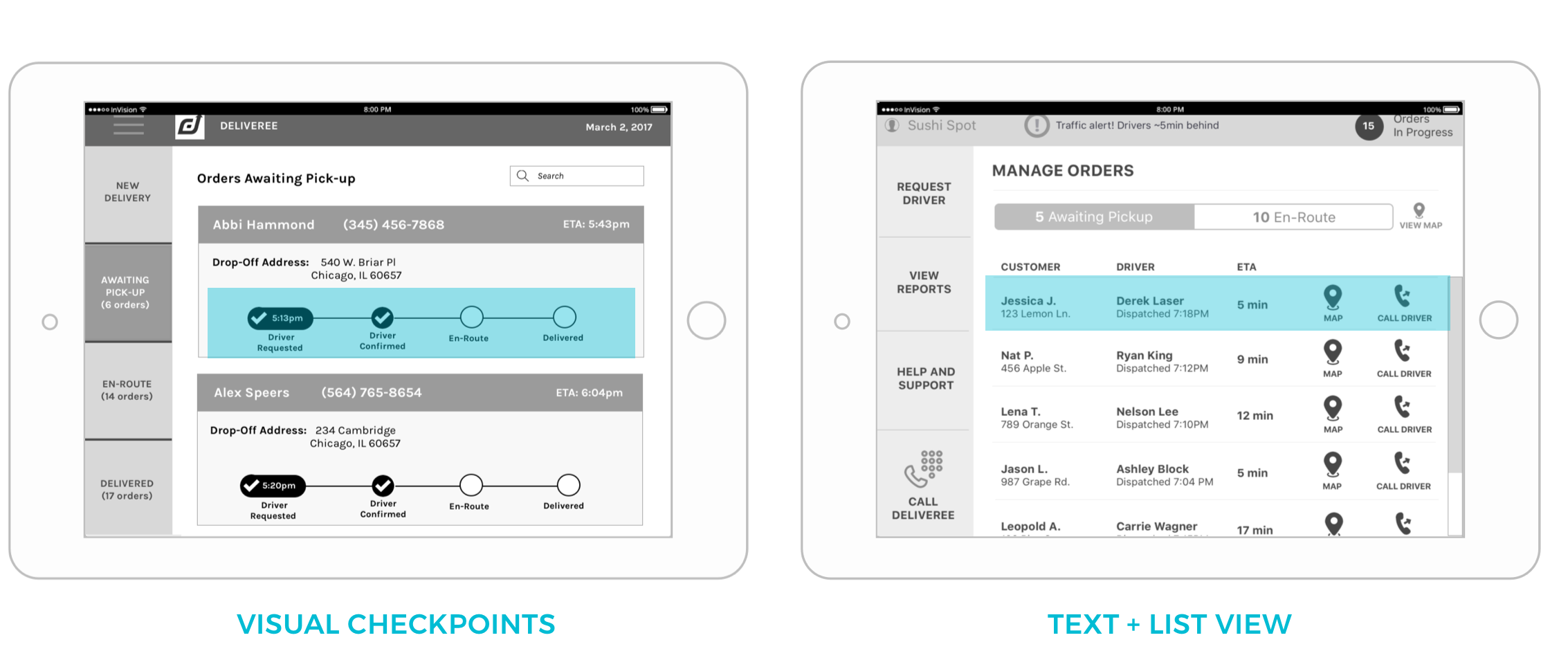
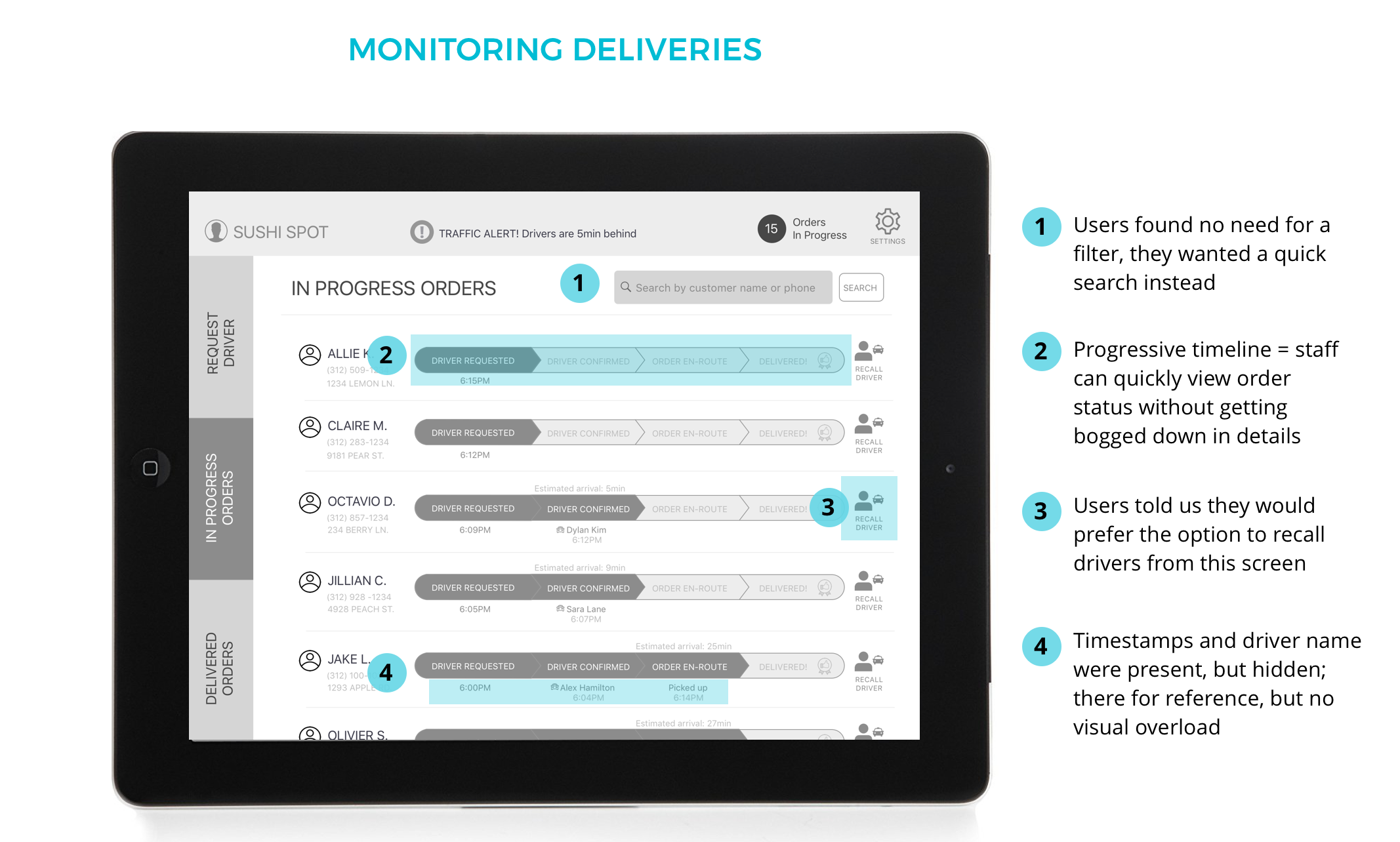
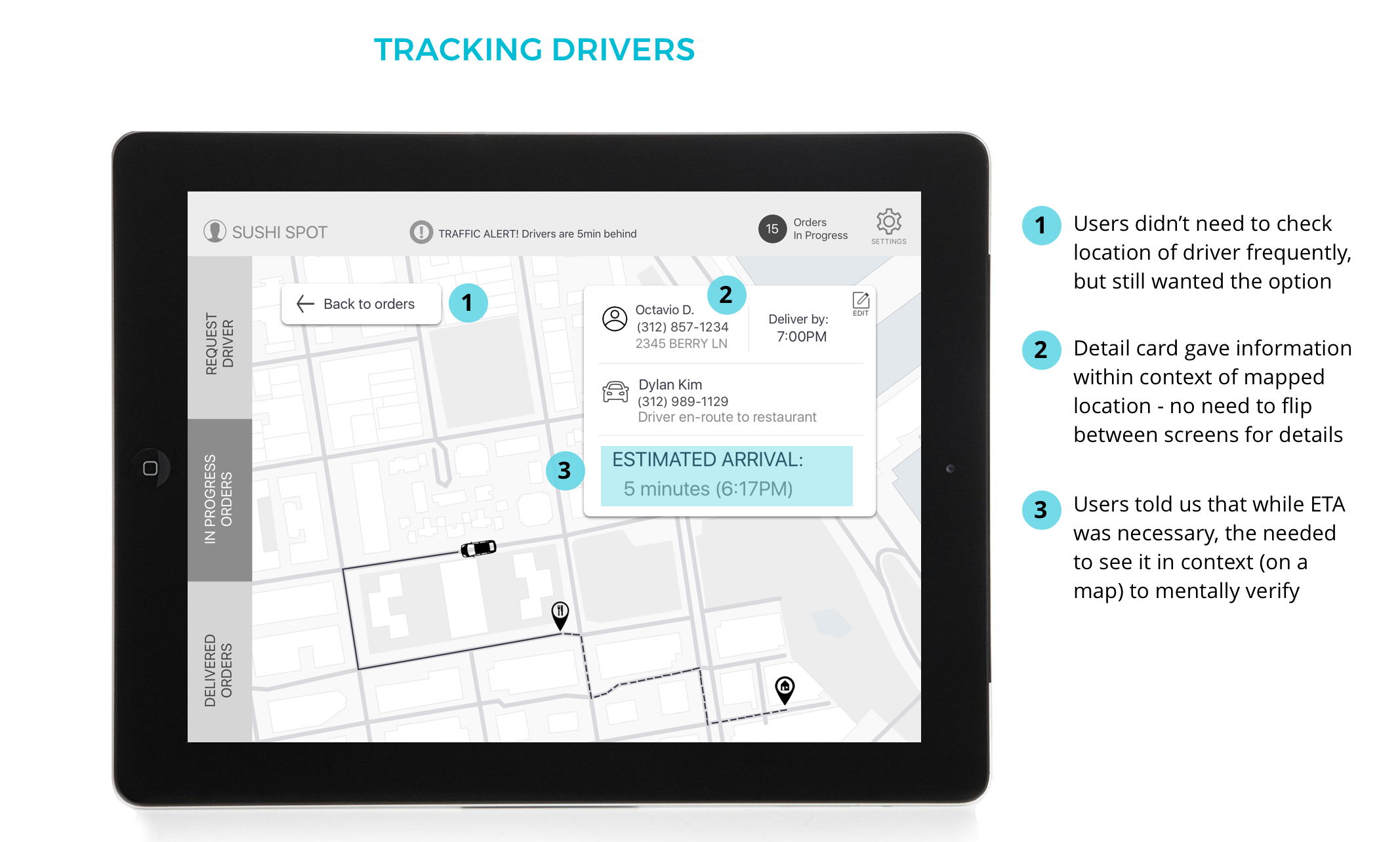
For monitoring orders, users were presented with the option of a visual "timeline" that showed progressive order status, or a more text heavy list view. Users preferred the visual status bar because they could quickly glance at the screen and get order status through the visual check-points. Another feature that resonated with users was the map tracking feature. While ETA was a "must have", the map feature was concurrently necessary to verify that the ETA was accurrate: users trusted the map location more than ETA, but found ETA more necessary a first glance. The map could be hidden from view and used when a user wanted more details.
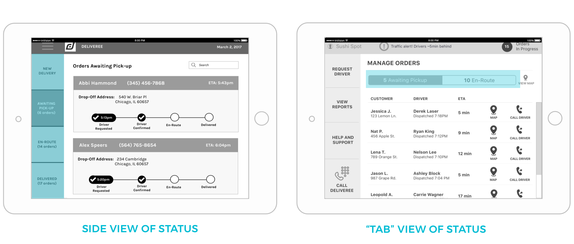
The final feature revolved around preferences for showing order status. We showed users two versions: categories (such as "picked-up", "en-route", etc.) of orders housed in left-side navigation or a "tabbed view" that housed orders under one screen, with tabs to toggle between their specific state. From users we learned the simpler the better. Users preferred to have a single side navigation (no tabs), but with "en-route" orders and "delivered" orders housed on separate tabs.
Final Design
After some adjustments, we presented a second round of prototypes to our users for usability testing. Taking the feedback from both our restaurant and driver users, we finalized our design.
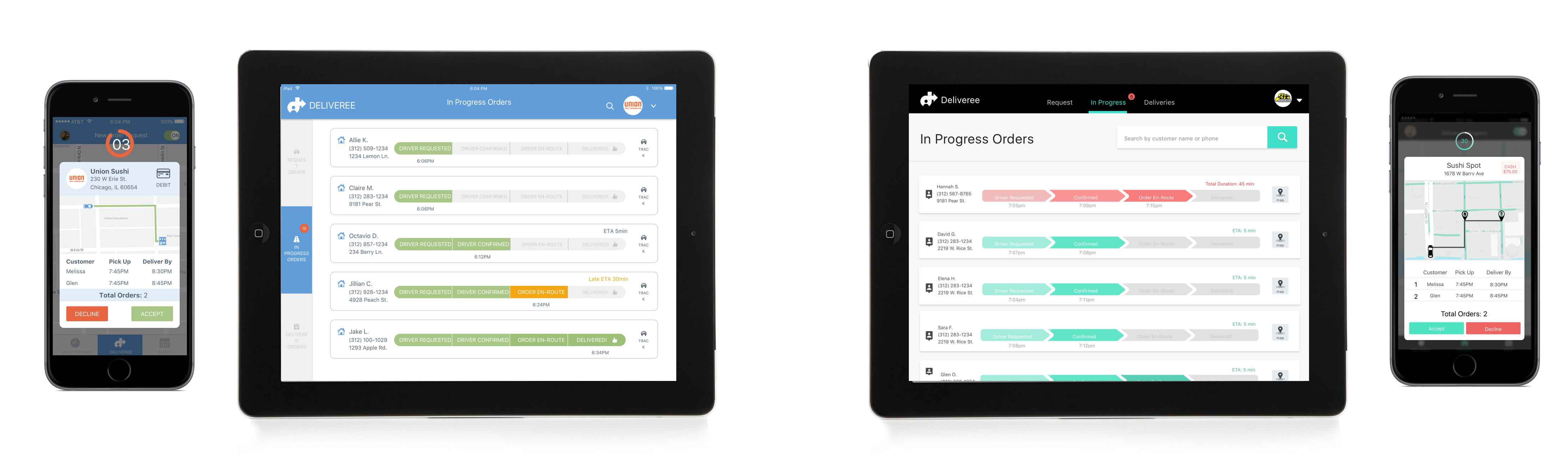
Drivers
Restaurants
Moving Forward
Since this project left us with a large amount of data from both user sides, we had some forward looking recommendations for Deliveree as a business moving forward.
Further Recommendations
Like most projects, there were issues and insights raised in our usability testing that we were not able to tie up before handing off our deliverables. Moving forward, there were several considerations that we had for our product.
For our drivers we wanted to further consider:
1. "Re-call driver" flow: This concept was something was brought to our attention by our restaurant users during user testing. Sometimes the restaurant makes a mistake with an order or the customer calls to make an adjustment. From this, we added the option to "recall a driver" for restaurants, but the full flow needs to be considered from the driver's perspective.
2. Shift scheduling: Since Deliveree's expansion will involve crowdsourcing drivers, we foresaw that drivers would need a way to schedule shifts themselves. Deliveree's management would no longer would need to be directly involved. However this feature needs more research and testing.
3. Profile + account page: users expressed the want for a profile page that contained personal information and shift schedules. In case of a lost phone, we reasoned that having this content be PIN protected would be a reasonable means of security, but both the content of the account page and our PIN protection measure would need to be further tested with users. For our restaurants we wanted to further consider: 1. Recalling a driver: Since this issue was brought up during our usability testing, we did incorporate it into our final design. However, we did not get a chance to test the flow with users and such it requires further testing. 2. Viewing uploaded reciept + confirming tip amount: While the "upload a reciept" feature was something that we encorportated into our driver product, we did not fully flesh out what this process would look like from the restaurant side. We envisioned that the flow would require flagging order reciepts for review, with the restaurant then tasked with confirming the driver's tip amount virtually. Unfortunately we did not have time to build out this flow, but still see it as means to further increasing efficiency for both parties. 3. Searching for customers: as opposed to our "filter orders" feature, users told us it would be quicker (and more intuiative) to search for customers directly. While we encorporated this feature into our final design, it still needs further testing. At the end of our three weeks we were able to present our designs to our clients and hear their thoughts. Collectively this project was a huge success for us and Deliveree. We started with a existing product that left restaurants in the dark and drivers using a complicated and archaic text-messaging system; we ended with a full set of flows for both users that not only streamlined the delivery process, but also didn't leave anyone in the dark. Two different UI concepts done by our UI team. Right screens by Melivin Latham; left screens by Sabrina Gagliano. Along with our research findings, we were also able to pass our annotated wireframes over to a UI team. It was incredibly insightful to work with designers who were looking at our product for the first time. I had to explain the reasoning behind my designs to a fresh audience, which was a challenge in recongizing areas that we had left holes and defending our final decisions. Our final designs (with UI polish) are currently set to go live in a few months. As we ended this project, there were many valuable UX intricacies that I felt like I learned. Chief among these was accounting and accommodating different user bases simulataneously. While building for two user bases was something that I had had previous experience doing, this project was different in the sense that our user types (and eventual products) were so tightly intertwined. Since both of our products hinged on direct actions that must be taken by the other user, the product’s success was determined by trying to both understanding and balance the needs of different users, but also understanding that there was one goal that must be collectively achieved by both products. Since our clients were definitely most interesting in the restaurant facing application (the product for their current/potential customers) we had to stick up for the needs of drivers. Since user experience encompasses the needs of all users, it was a balancing act of accounting for both sets of users while maintaining a cohesive, end plan. This project taught me the process of building and thinking strategically in terms of two different products and two different flows. Since we needed to explicitly build to give restaurant users the status of deliveries, we had to really strategize on how to fold those necessary features into the driver application. Through this I also learned how important it is to identify and account for the most extreme/fringe use cases (such as a driver managing 6 deliveries at one time). Overall, this project was incredibly challenging and insanely fun. I learned alot about the restaurant business and was able to further build up my UX skills (and learn a few more along the way). In the end we created a solid product that one user said was "so easy my grandpa could use it." Mission accomplished. Special thanks to my teammates Lena Tran and Jeanette Wu. Cheers to three weeks of fast-food filled screen flows and eventful usability tests in crowded restaurants booths #blessedforolven
Next Steps
Final Thoughts

Special thanks...