
Redesigning the Incentive Ecosystem

Overview
Automotive special offers on sites are notoriously difficult to navigate, often hiding the exact deals buyers want behind dense jargon and fragmented consistency through the exploration experience. For a leading automotive manufacturer, we redesigned their special offers hub to simplify discovery, optimize deal hunting and build trust. By transforming a fragmented grid of promotions into an intuitive, user-centric ecosystem, we successfully bridged the gap between national manufacturer incentives and local dealer actions.
Goal
Automate the Backend: Create dynamic design templates that ingest data streams automatically to eliminate manual entry.
Demystify the Frontend: Design clear, scannable layouts that allow users to easily understand, compare, and contextualize promotions within their full financial picture.
Challenge
The client’s existing offers ecosystem relied on high-friction manual data entry and delivered a confusing, fragmented browse experience for car buyers. The team faced a dual hurdle: eliminating tedious backend content management for the client while simultaneously transforming complex, jargon-heavy automotive financing data into something transparent and actionable for users.
Discover
Understanding User Behavior
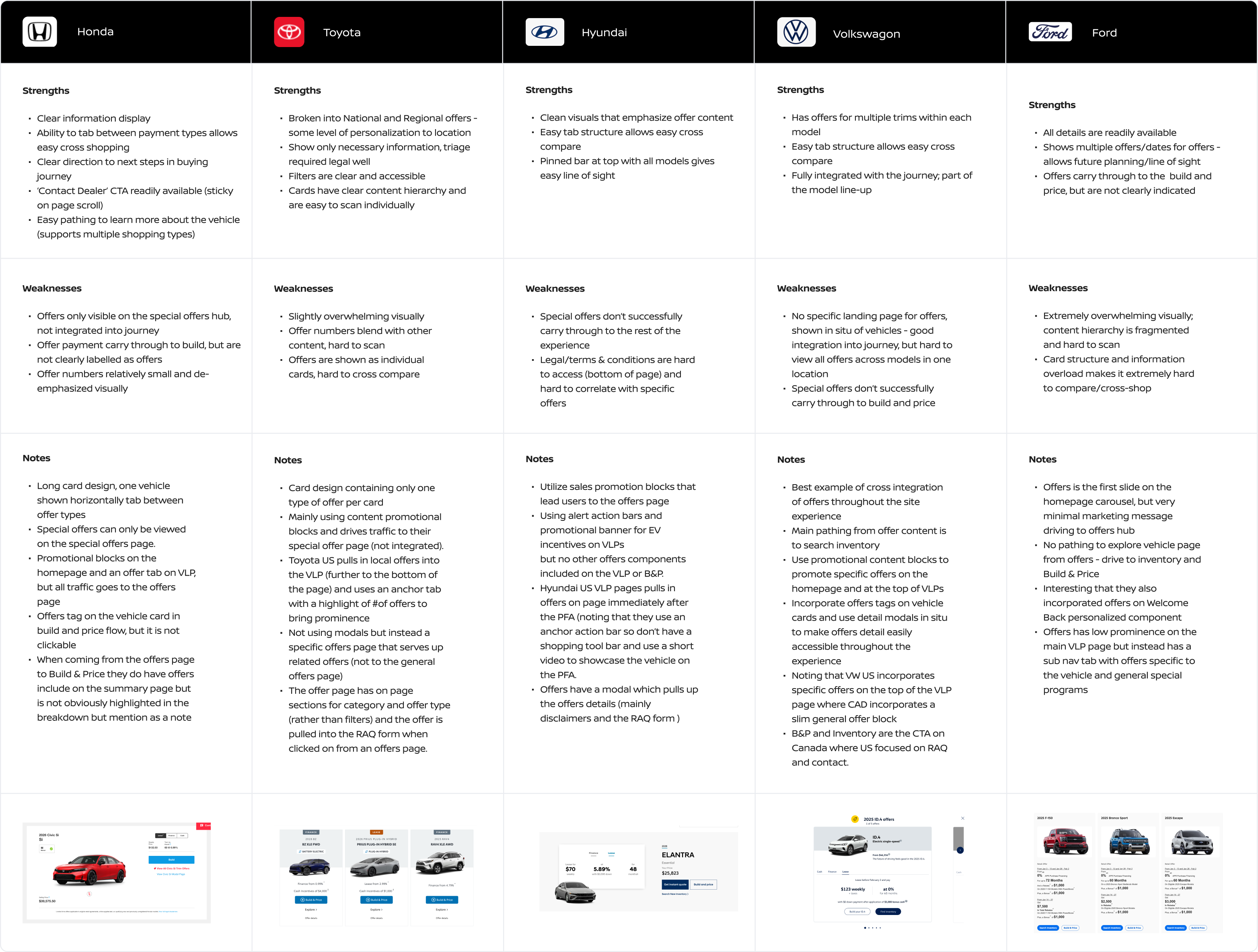
We started with consumer and market research to set our baseline. Through research we concluded that today’s vehicle buyers expect total clarity. Price sensitivity isn't an edge case anymore, it's the baseline. Buyers demand easily accessible deals at every point of their journey, clear breakdowns of included features, and an effortless way to cross-shop trims and payment options with absolute price transparency.
What's the Competitive Market Doing?
Pricing transparency is one of the biggest contributors to a trust gap of consumers in the auto industry, with the Auto Industry's Trust and Like score of 63 being the lowest among consumer facing industries.
Define
Core Experience Bottlenecks
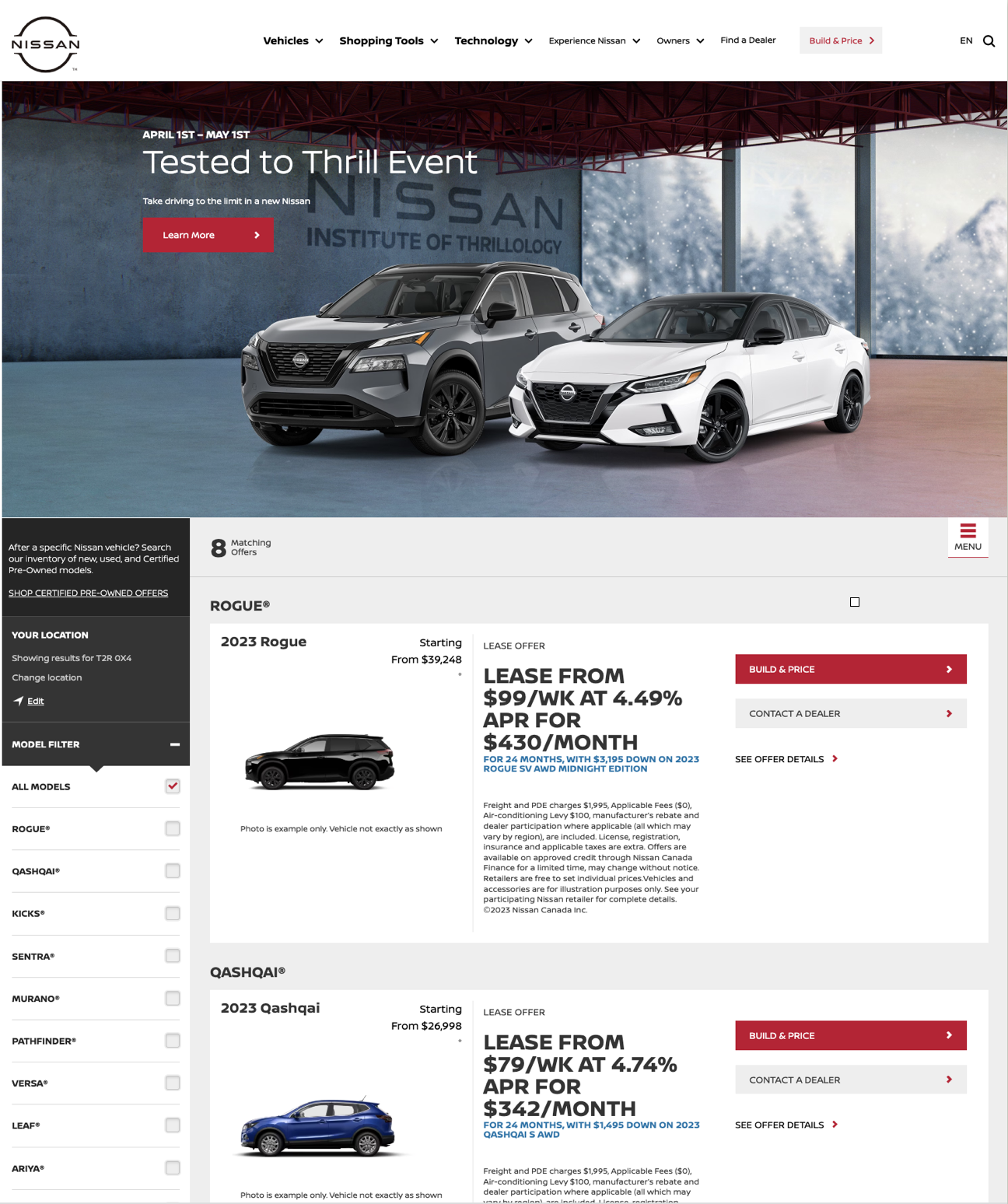
Analysis of the legacy offers system showed three primary usability barriers impacting conversion:
Excessive Page Length: Overly tall card containers and inefficient padding forced excessive scrolling.
Friction filled Cross-Shopping: Fragmented layouts made side-by-side comparison of trims and payment types (Finance, Lease, Cash) difficult for high-intent buyers.
Text-Heavy Cognitive Load: Unstructured copy blocks and prominent legal disclaimers obscured key financial metrics, slowing down user comprehension.
Key Experience Principles
Knowing our starting point, we created a set of experience principles to guide our new concepts.
For the User....
Clarity: Simplify complex automotive data into easily digestible offer formats.
Comparability: Enable effortless side-by-side comparisons of different incentive options.
Context: Display offers within the broader context of the buyer's full financial picture.
For the Client...
Automation: Create dynamic templates that allow incoming offer data to populate automatically.
Efficiency: Eliminate the need for manual data entry and content management.
Scalability: Build a flexible design system that adapts to varying promotions across multiple vehicles.
Initial Concepts
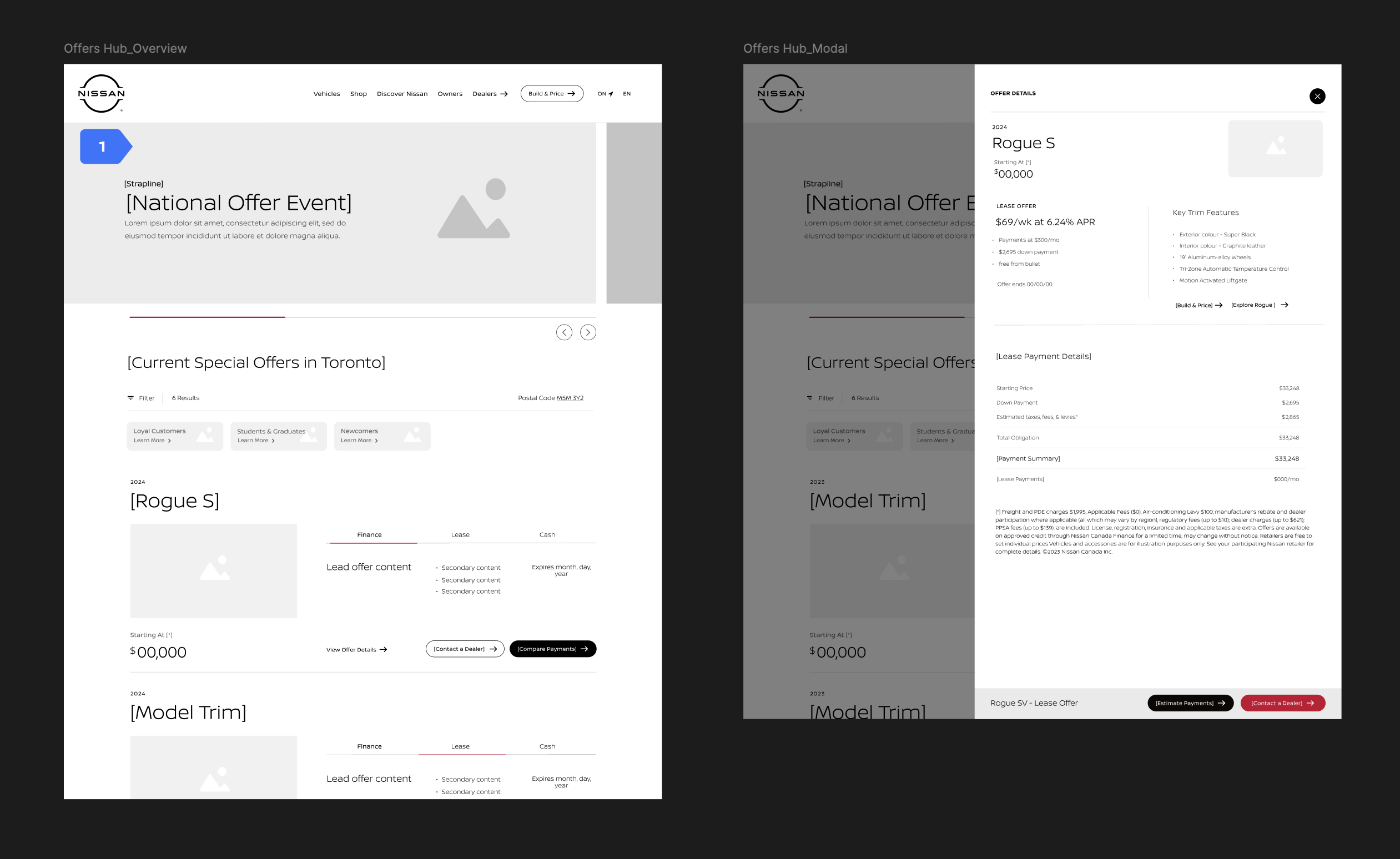
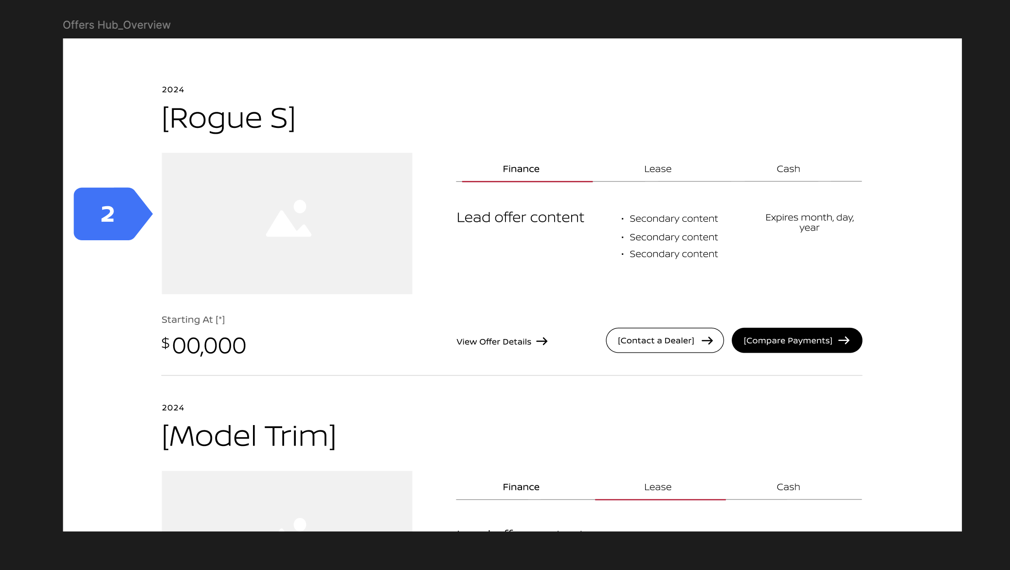
1. The Global Entry Point (The Hub)
What it is: The main landing page displaying all available vehicle models.
UX Strategy: Designed a model-first layout. Because user testing showed buyers shop by model before looking at specific deals, this layout acts as a clean grid that lets users select a vehicle nameplate without feeling overwhelmed by complex numbers right away.
2. The Multi-Offer Model Card (The Comparison Layer)
What it is: The component view where various trims and payment options live side-by-side.
UX Strategy: use structural tabs for Finance / Lease / Cash. By using a modular card system with fixed column widths, the layout automatically is consistent across the page. When the data feed injects dynamic pricing, users can effortlessly cross-shop and run side-by-side price comparisons due to consistency for scanability.
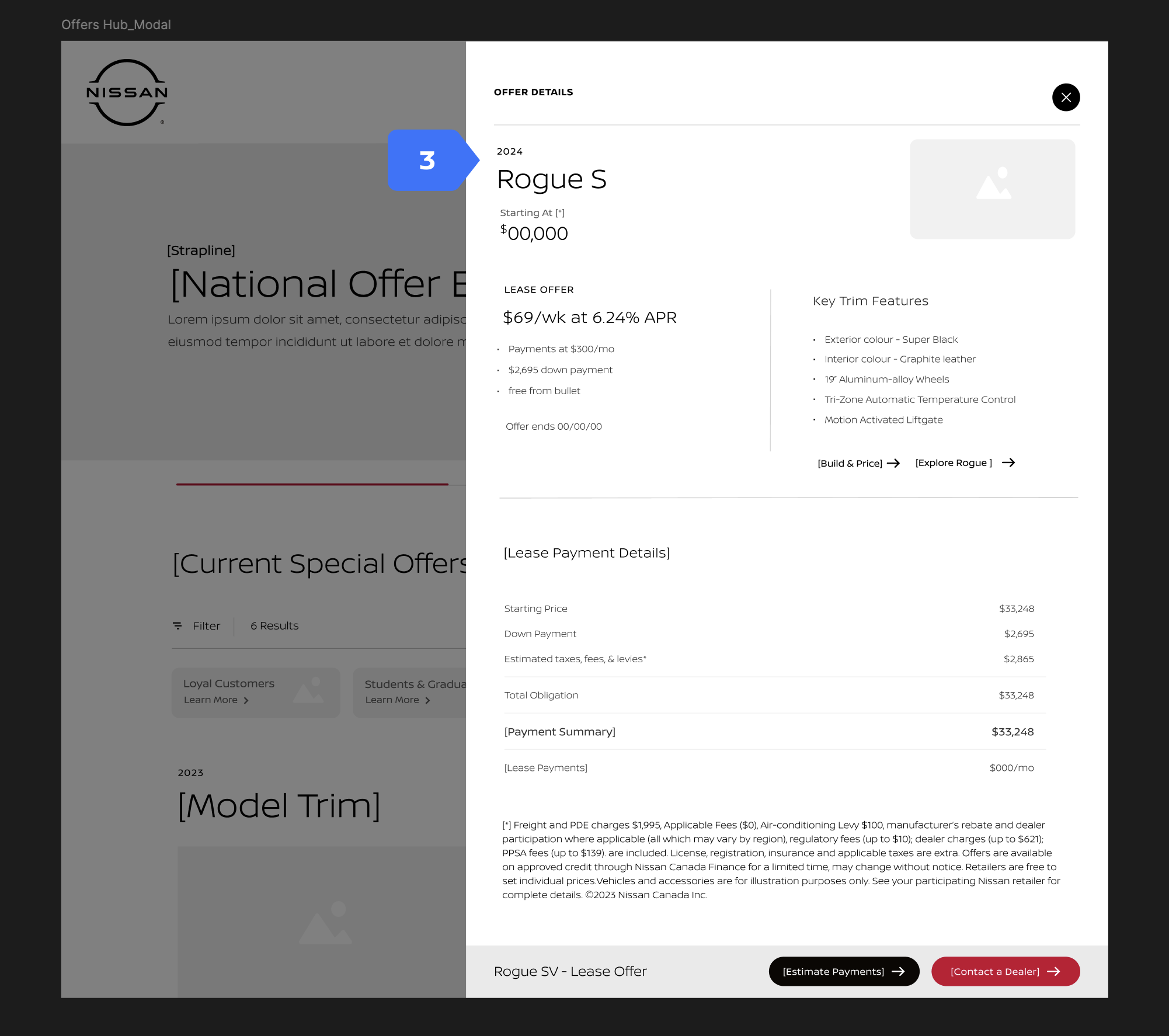
3. The Comprehensive Offer Detail Modal (The Trust Builder)
What it is: The deep-dive view of a specific promotional offer.
UX Strategy: This modal shows full offer details, localized pricing breakdown (driven by the user's postal code), and transparent legal disclaimers in a single visual hierarchy. Through context and legal disclosure, we aimed to eliminate the user anxiety surrounding "hidden fees" while not overwhelming the main hub page.
Test
To validate our assumptions about user behavior and test our new structural layout, we moved to user testing. We interviewed and ran a usability test of a 8 current or prospective Nissan customers.
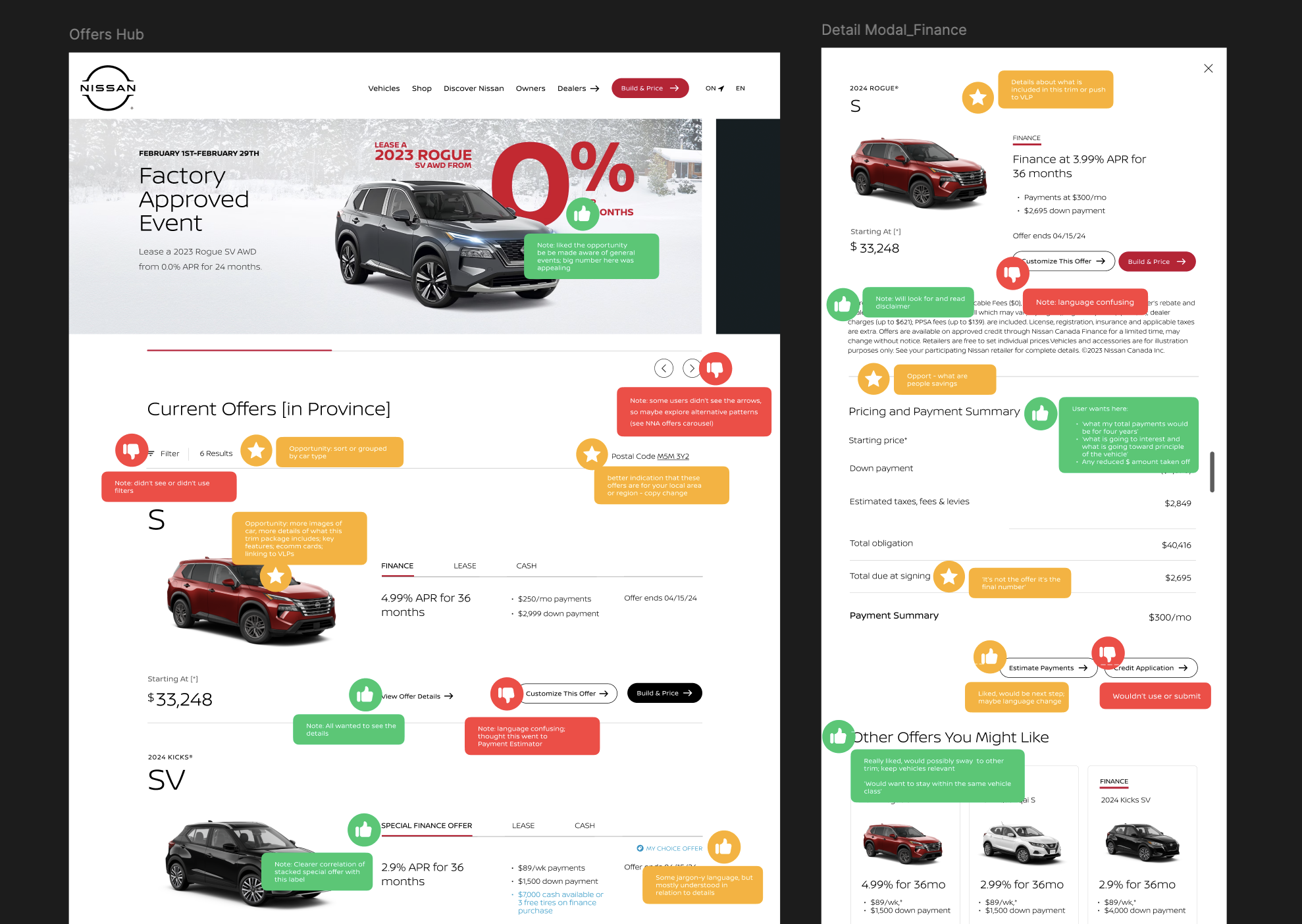
Key User Testing Feedback
Develop
Building a Modular Template
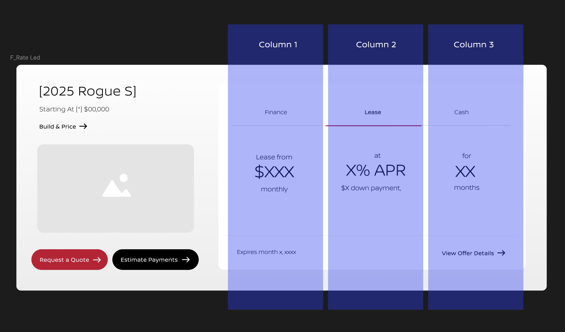
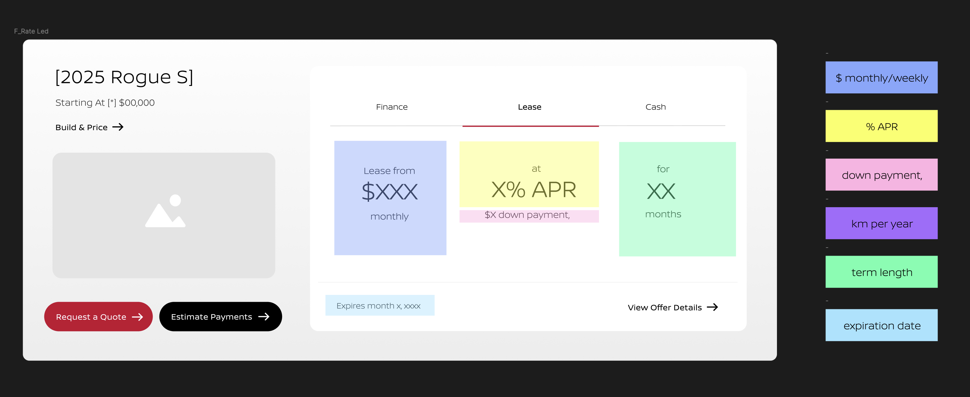
To support automated backend data ingestion and eliminate manual UI updates, we engineered a scalable, component-driven template system designed around three key constraints:
1. Variable Character Counts
Car names, trim descriptions, and legal disclaimers vary wildly in length. We established strict text truncation rules, dynamic spacing, and flexible container rules to ensure layouts remained clean and scannable regardless of text volume.
2. Conditional Data States
Not every automated vehicle feed contains the same data. Some offers feature a down payment, while others only feature an APR rate. We designed modular "plug-and-play" components within the card layout that collapse gracefully if specific data points are missing from the feed.
3. Component-Driven Layouts
To support cross-shopping and side-by-side payment comparison (Finance vs. Lease vs. Cash), the layout templates were built on a standardized component grid. This allowed the client's technical system to automatically generate uniform columns for easy comparison, no matter how many payment options the data feed injected.
Refine
Negotiating Legal Text Creep
Following user testing, we stress-tested the automated templates against Canadian price transparency regulations.
The Challenge: Canadian price transparency mandates required heavy compliance copy, which bloated the layout and buried core offer metrics during stress testing.
The UX Action: Used testing data to advocate for a design iteration that balanced regulatory requirements with clear visual hierarchy.
The Outcome: Restructured legal disclaimers into clean, secondary micro-copy—preserving high-level offer scannability without sacrificing compliance.
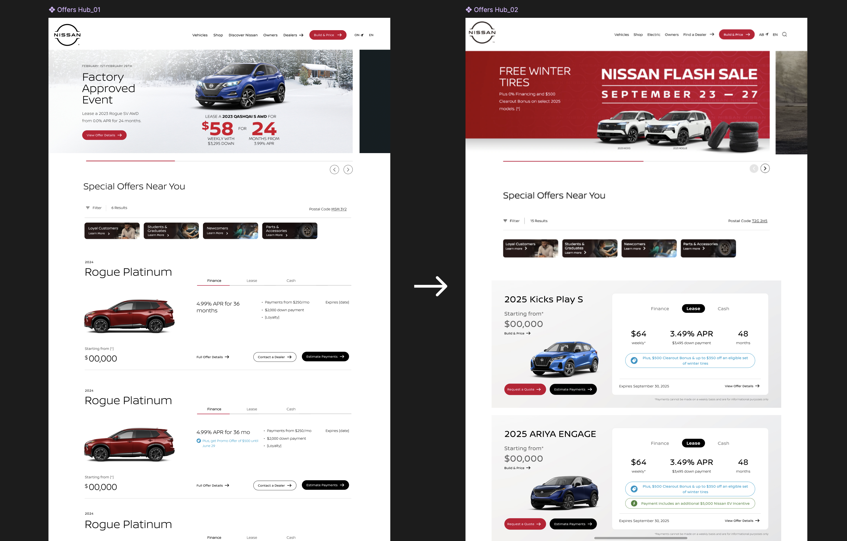
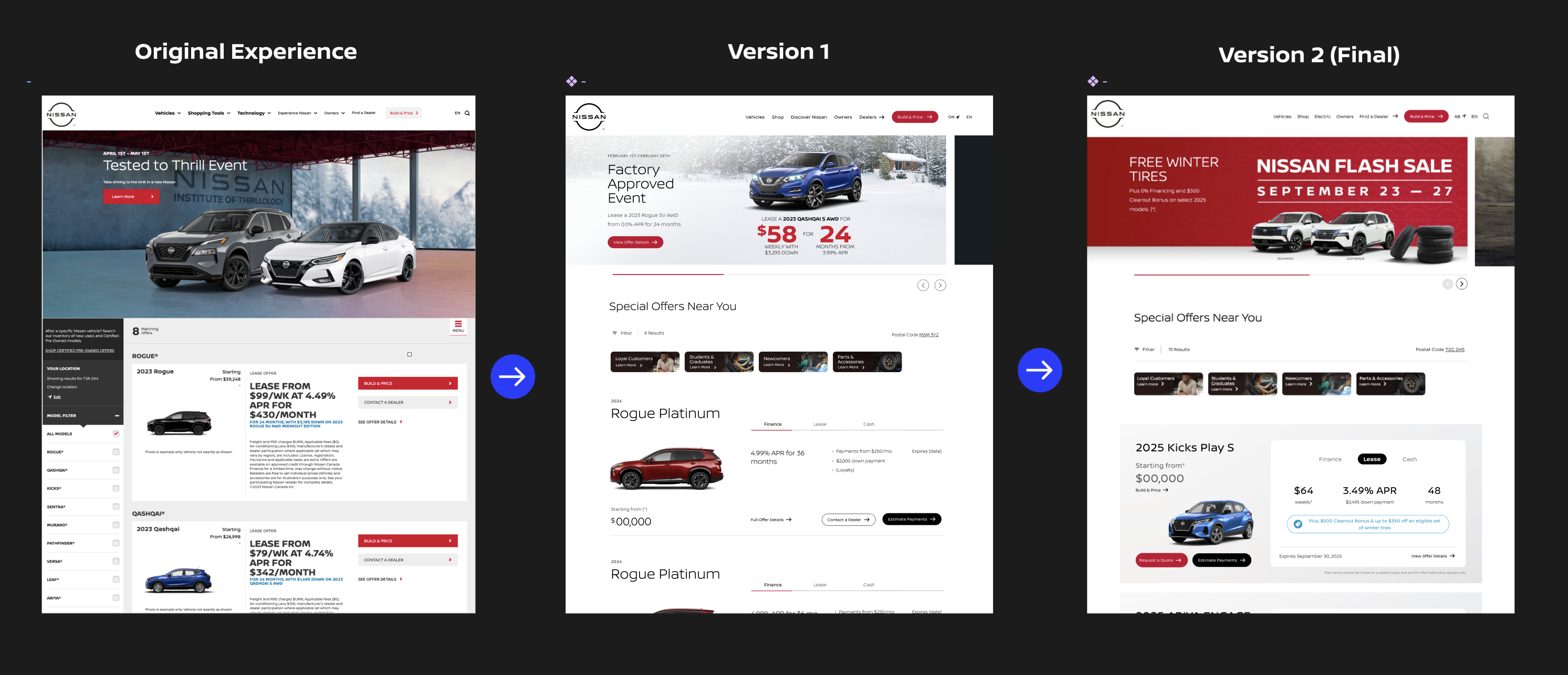
Version 1.0 to Version 2.0
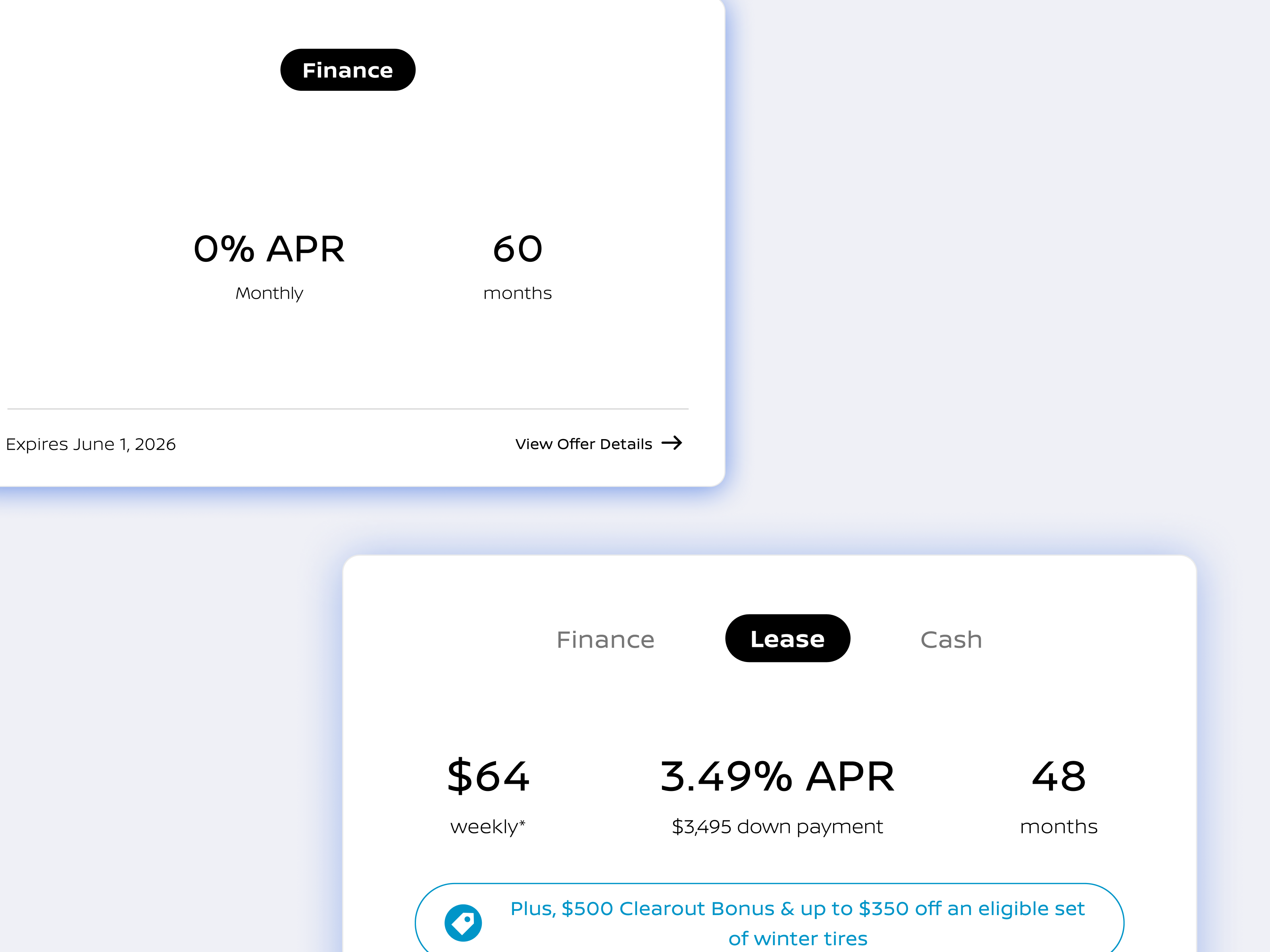
A strategic pivot on the client side post-launch provided an unexpected opportunity to optimize our initial release. Moving from Version 1.0 to Version 2.0, we stripped away legacy styling constraints and shifted toward a highly streamlined, conversion-focused layout with greater visual depth to emphasize offers, anchor the offer comparison experience within a model, and better sh
Final Results
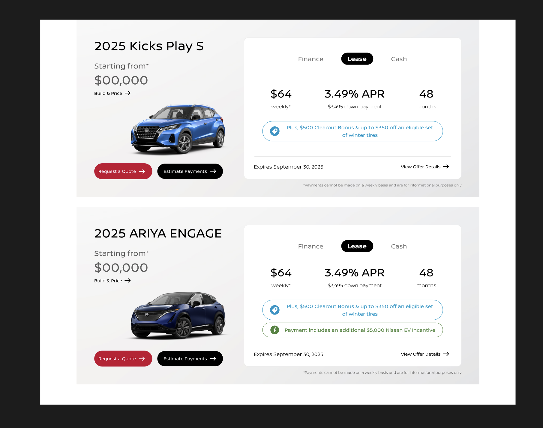
The Designs (2.0)
By bridging Canadian price-compliance mandates with modular system design, the redesigned Special Offers platform transformed legal constraints into a competitive advantage. The result is a transparent, component-driven experience that simplifies complex vehicle pricing and empowers buyers to cross-shop with confidence.
Impact
Version 1.0 Launch Outcomes (December 2025)
The structural shift to automated, transparent templates yielded massive engagement wins across both mobile and search traffic:
Version 2.0 Deployment (May 2026)
Following the strategic post-launch client pivot, Version 2.0 went live in May 2026. The product team is actively monitoring performance variance against the Version 1.0 benchmarks to ensure that the streamlined visual depth, emphasized offer copy, and updated Call to Actions (CTAs) further maximize dealer lead generation.
Reflection
System Design Precedes Visual Design
Building component-driven layouts for automated data feeds eliminated manual workflows and made the UI resilient against unpredictable backend data.
Legal Constraints Can Drive Better UX
Embracing Canadian price transparency laws forced deep legal collaboration, turning potential interface clutter into a transparent, trust-building experience.
Case Studies Are Never Truly "Done"
Evolving from V1.0 to V2.0 based on live site metrics proved that post-launch iteration turns good interfaces into high-performing conversion engines.