
Express Carryout Ecosystem
Overview
Designing an Express Pick-up Experience
While mobile ordering promises speed, quick service restaurant customers often face a last-mile bottleneck: waiting in walk-in lines to collect digital orders. To solve this for a major Chicago pizza chain, we designed an Express Carryout experience, a digital-to-physical "fast pass" that synchronized app status tracking with in-store pickup to bypass line friction.
Goal
Our primary goal was to increase digital app conversion and user retention by solving the physical pain point of in-store waiting while also managing the technical constraints of the POS and kitchen ops.
Business Goal: Boost digital app conversion and account sign-ups by positioning "Skip the Line" as an exclusive member benefit.
Service Goal: Connect the mobile app, Point of Sale (POS) system, and physical store layout for a seamless order handoff.
Challenge
Legacy POS and kitchen systems required users to manually tap an "I'm Here" button in the digital experience upon arrival to release the order. Our challenge was designing a frictionless experience that guided users to complete this required digital trigger, ensuring that the physical handoff succeeded without user error.
Research & Define
Observing the Service Ecosystem
As we thought about our digital mobile experience, we first had to understand the real world user flow to which the mobile experience was so closely tied. We moved beyond the screen to understand the service blueprint through in person restaurant visits, staff interviews, and user observations.
Our research involved competitive benchmarking and on-site ethnographic observations.
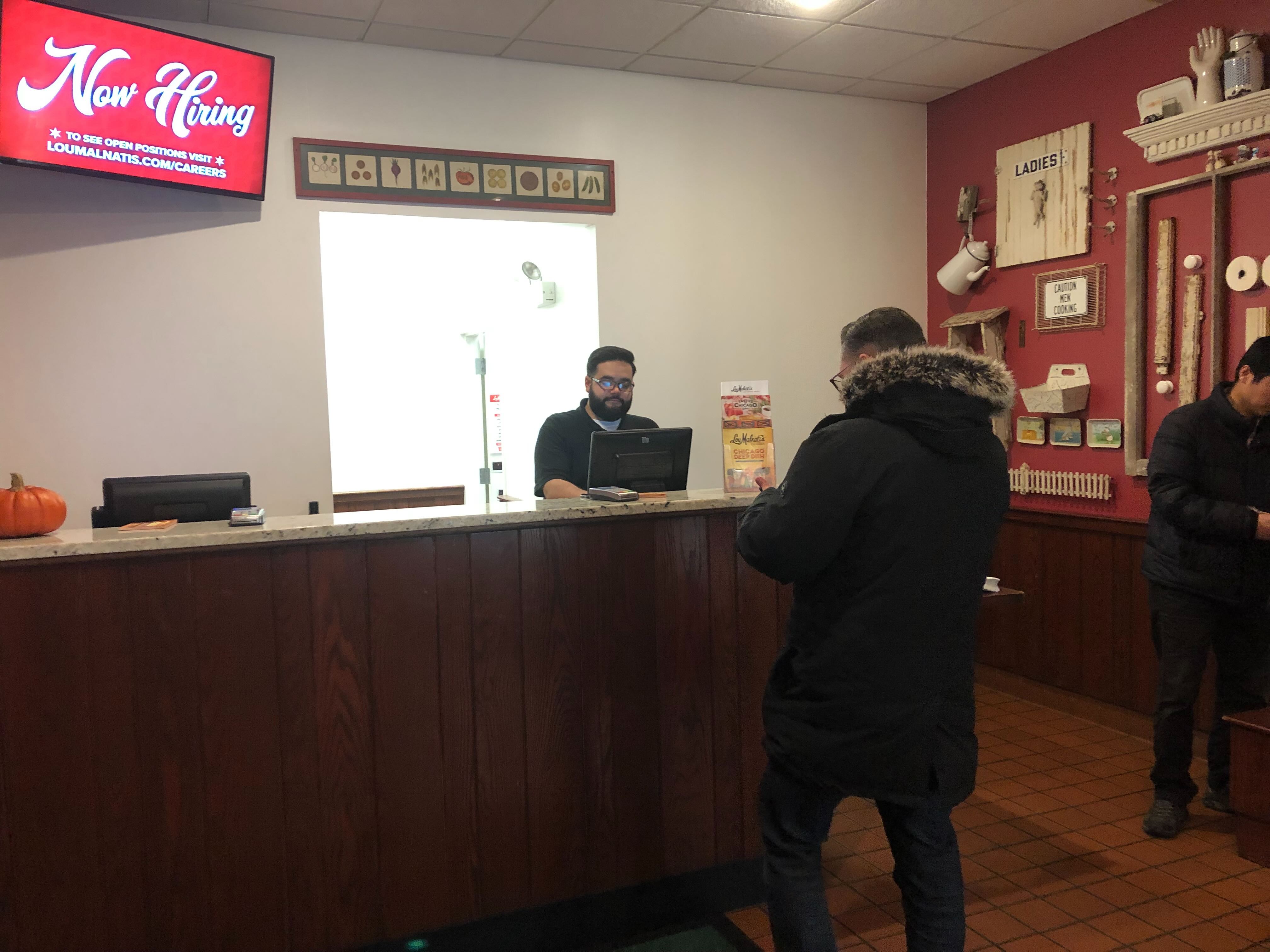
On Site Observations
Through visiting several physical restaurant locations, we identified two critical gaps for the order pick-up process:
1. Where do I go?
Users felt anxious entering a store without knowing where to stand or where to go, hovering near the counter unsure whether they should interrupt the line. This completely nullified the value of mobile ordering.
Experience Consideration - clear cues on where to go and what to do.
2. Operational Lag
Kitchen staff often didn't know a carryout customer was present until they reached the counter. Once they reached the counter, the order would still have to be retrieved from the kitchen wasting even more time.
Experience Consideration - a digital "bridge" to alert the staff the moment the user arrived.
The "Digital to Physical" Hand-off
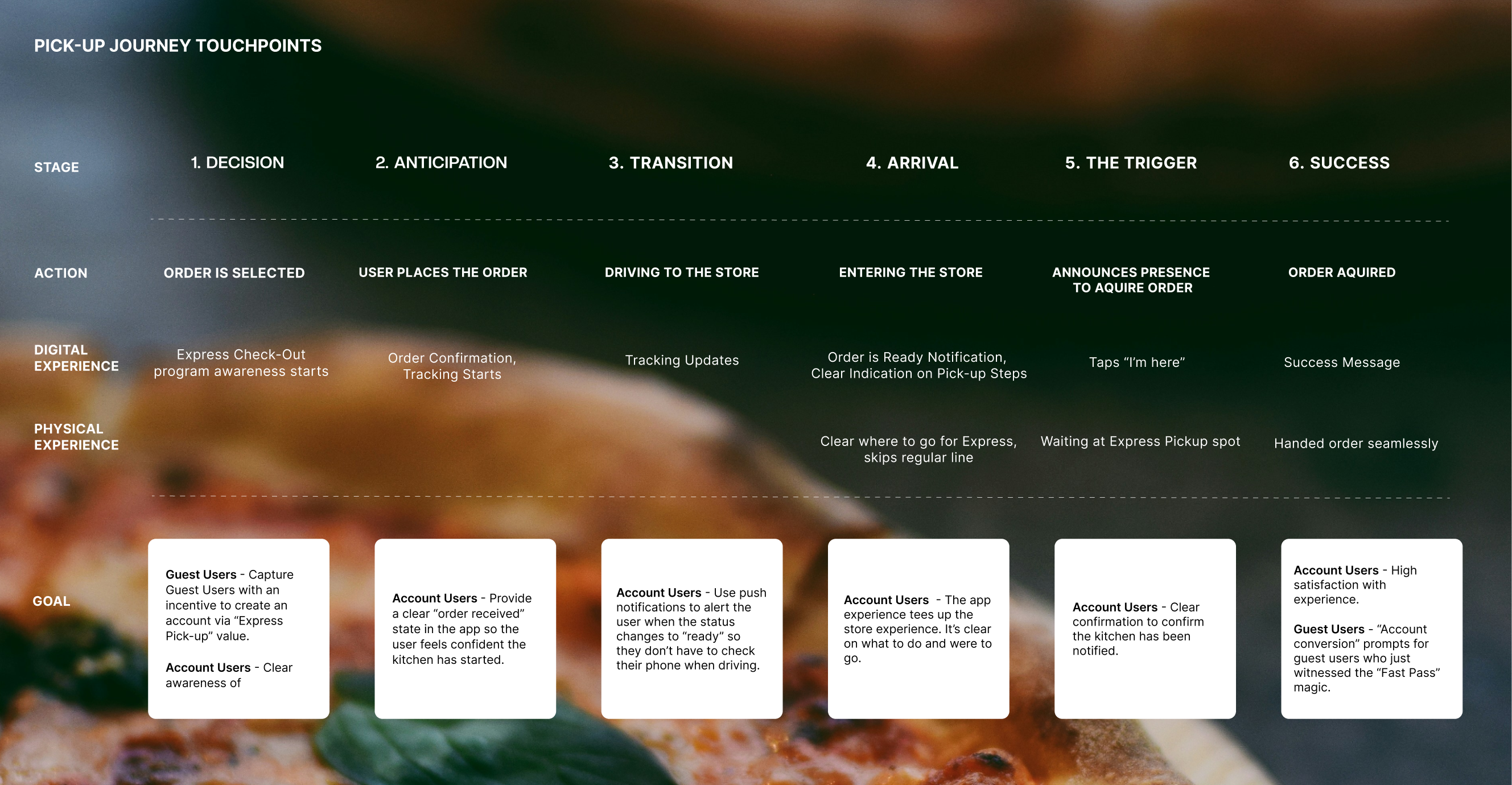
Based on our research, we mapped the user’s journey across six phases to identify where "friction" would likely cause the service to fail. The most critical points were between Arrival and The Trigger, in which a consumer would be experiencing the hand-off between the digital experience and physical store experience.
Ideate
Creating a Digital Compass
We moved into ideation for our digital mobile experience with three Service Design principles:
Transparency
No mystery meat. Users must know exactly where their order is in the "Kitchen -> Counter -> Hands" pipeline.
Minimalism
The app shouldn't distract the user while they are driving or walking into a store.
Contextual Awareness
UI elements must change based on the order's status and the user’s physical proximity to the pick-up location.
Concept
Floating Action Button - The Dynamic "Single Source of Truth"
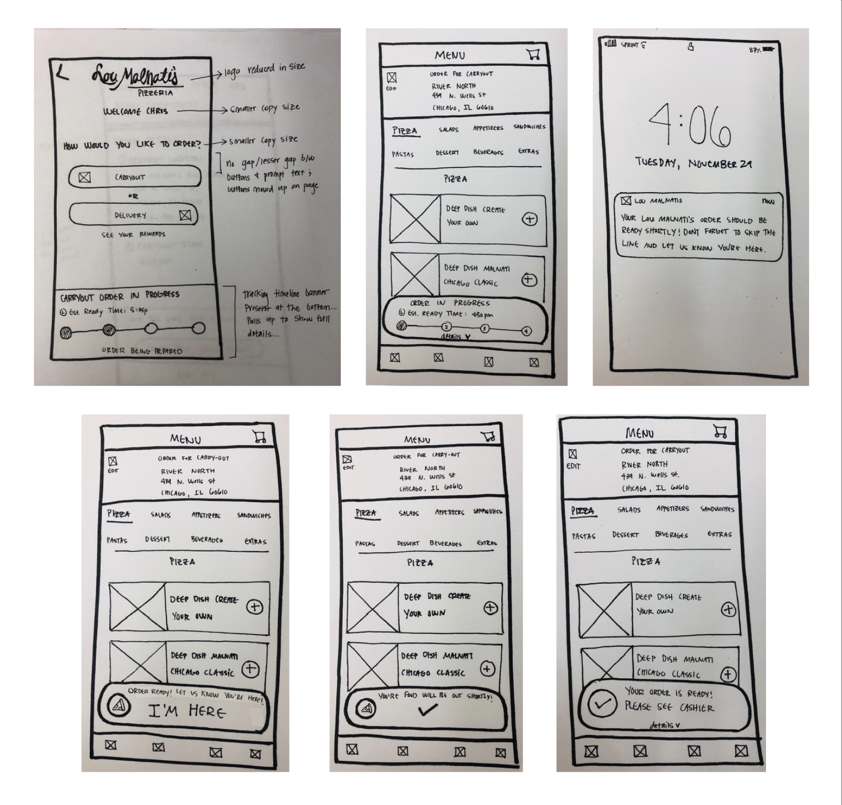
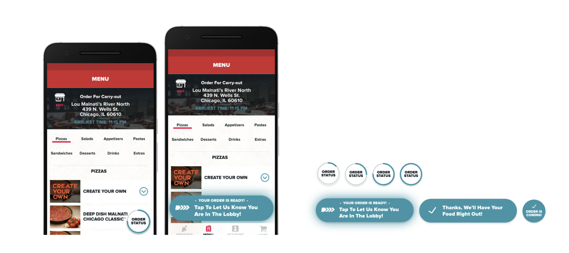
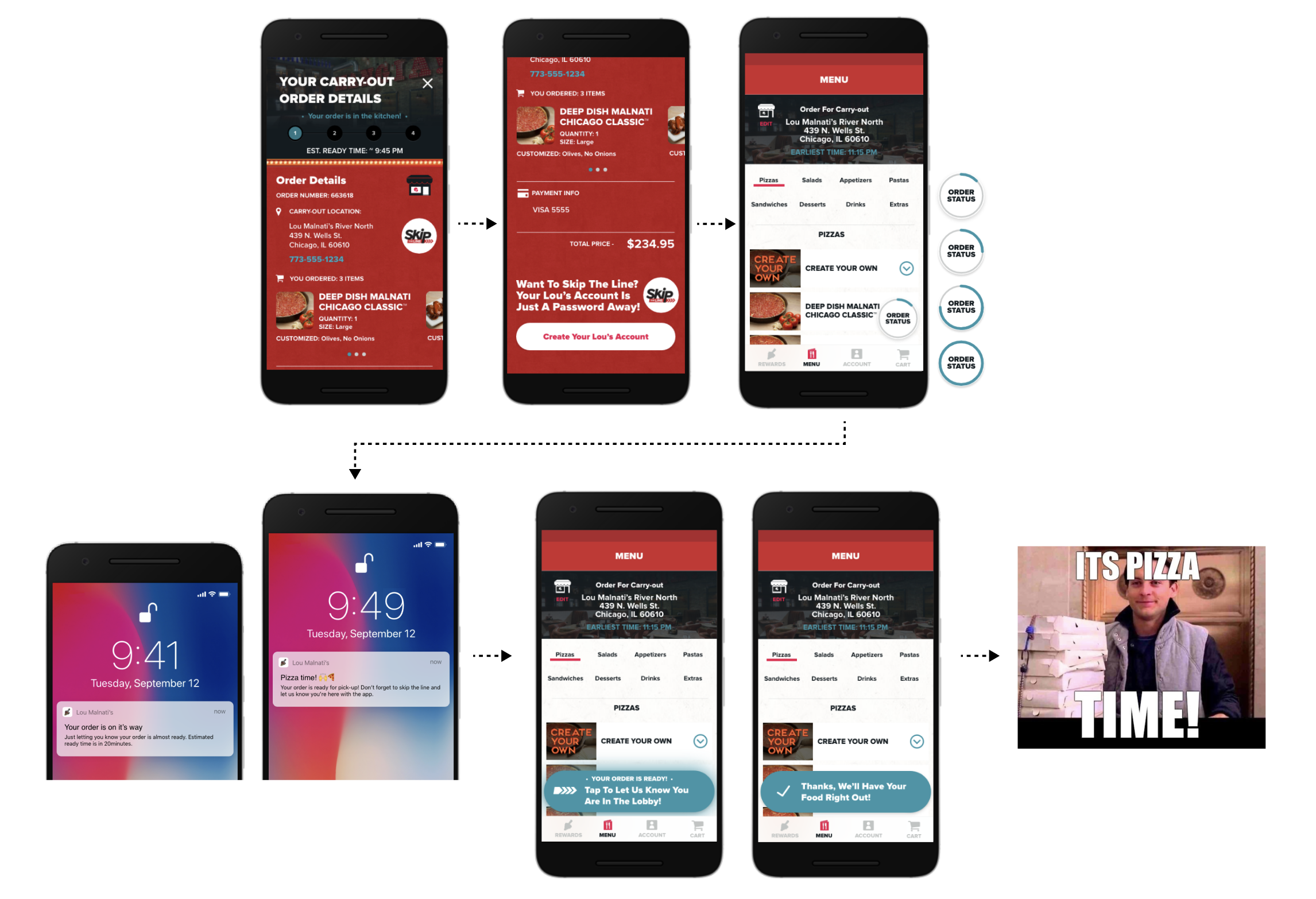
We iterated on how to represent order status. Rather than a static "Order History" page, we leaned into a Dynamic Floating Action Button (FAB) that stayed persistent and communicated steps in an easy to glance at way. This acted as a persistent "Digital Compass" that lived across the entire app, changing its state from "Baking" to "Ready" to "Tap to Check-In."
The final concept was a three-part experience set...
Feature 1 - The Digital Beacon (The FAB)
Insight - Users didn't know when or how to announce their presence in store.
Design response - A compact, persistent UI element that handled complex states, including the edge case of multiple simultaneous orders, without cluttering the interface.
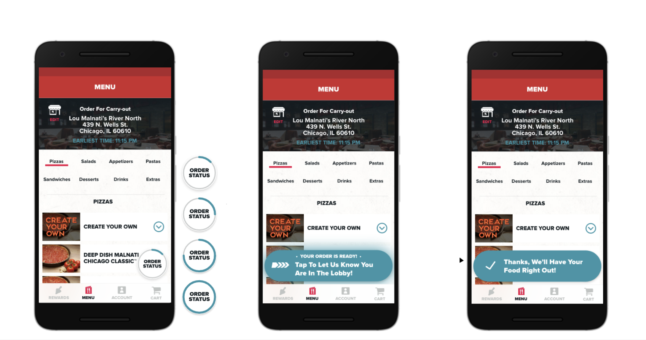
Feature 2 - The Manual "I'm Here" Trigger
Insight - The POS system needed to close the order via a manual trigger; users were unsure what to do when arriving.
Design response - a high-visibility "I'm Here" state of the FAB that only appeared when the order was "Ready".
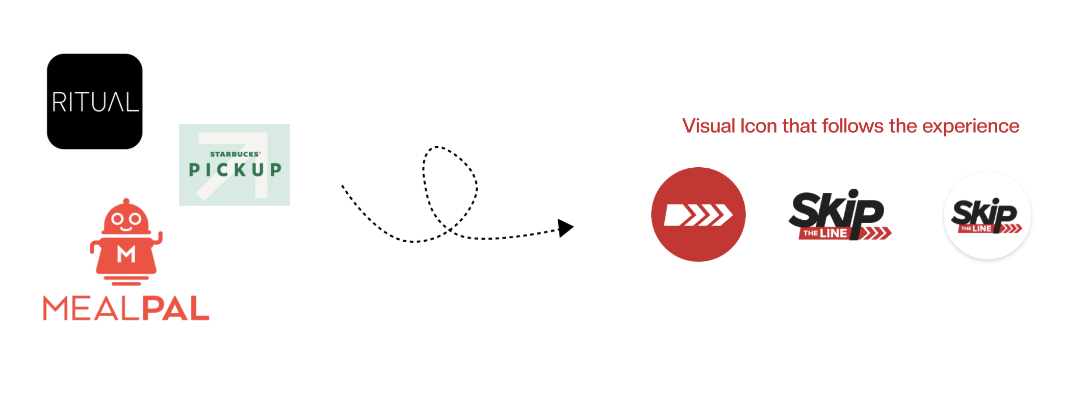
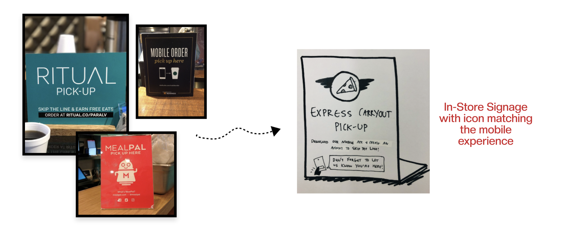
Feature 3 - The Visual Anchor
Insight - consumers were unsure of where to go when arriving for pick-up.
Design response - a specific "Express" visual icon in the app that perfectly matched the physical floor decals and overhead signage in the restaurants, reducing cognitive load during the digital to physical transition.
Converting the Guest User (A Sidequest)
We also identified that "Guest Users" were a missed opportunity. Research revealed that upfront "Sign Up Now" pop-ups drive high bounce rates. Instead of forcing immediate registration, we maintained guest checkout flow while introducing the "skip" as a benefit-driven gate. By framing the "Skip the Line" express lane as an exclusive perk, we leveraged convenience to incentivize account creation.
Opportunity 1 - The "Tease" (Guest Checkout)
During the checkout process for guest users, we didn't hide the Express Carryout option. We displayed it as "locked" or "account user only".
Design Choice: "Lock" the Skip the Line experience under account creation.
Psychological Trigger: loss aversion - the user realizes they are about to choose a "slower" service simply because they aren't logged in.
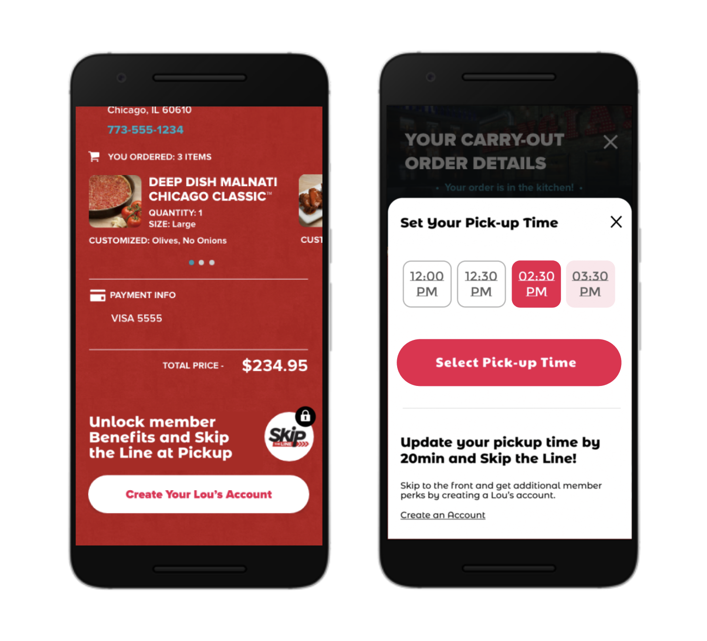
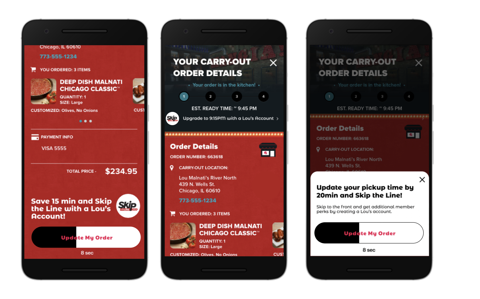
Opportunity 2 - The Contextual Prompt (The Pitch)
Once the guest user selects their pickup time, trigger a value prompt for conversion again. By placing this at the point of highest intent (right before paying), the value proposition, saving time, is at its peak.
Psychological Trigger:
Reduced cognitive friction - They're no longer in execution mode of selecting a food order and coordinating the pick-up details. There's more mental bandwidth to intake the value prop.
Ownership effect - they've created their order and "own" the outcome. They may feel more inclined to "protect" their order and may be willing to take extra steps to do so.
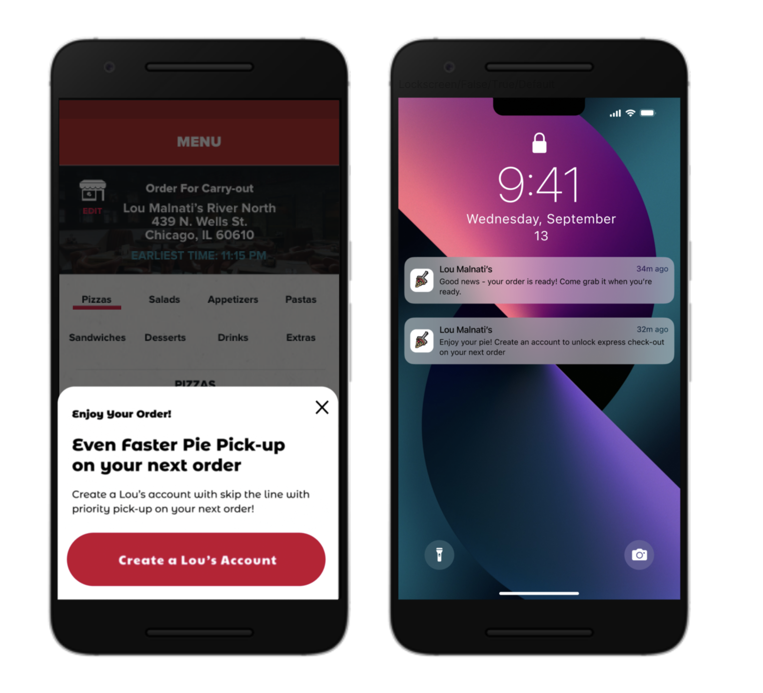
Opportunity 3 - The "Post-Service" Hook
If a guest still chooses not to sign up, the service doesn't stop selling. After they pick up their pizza (the "Aha!" moment where they saw others using the Express lane), we sent a push notification and in-app messaging that showcased the value prop of Express Pick-up and account creation.
Psychological Trigger:
Perceived Value Clarity - because a consumer has seen the benefits of the Express Pick-up play out in real time, the hits harder.
Results & Outcomes
Bridging the Last Mile Bottleneck
By aligning digital interactions with physical restaurant behavior, we successfully launched the Express Carryout experience, transforming a technical limitation into an intuitive user habit. Despite the constraint of a manual "I’m here" trigger, the design successfully bridged the gap between the mobile app, the legacy POS, and kitchen operations.
Reflection
Mastering Digital to Physical Service Design
This project proved that software success in QSR depends on real-world human behavior and physical space. By framing a technical constraint of the manual check-in as a moment of user empowerment, we demonstrated how UX design can shape physical habits and store operations.
Following the successful Chicago pilot, the franchise adopted our integrated app-to-POS architecture and physical pickup layout as its national operational blueprint for all future off-premise and curbside retail experiences.